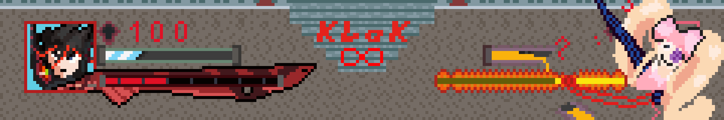
Mandy to Pixel Art - pushing pretty pixels around@lemmy.ml · 8 months agoI made a Kill la Kill Fighting game hud mockupimagemessage-square2fedilinkarrow-up112arrow-down10file-text
arrow-up112arrow-down1imageI made a Kill la Kill Fighting game hud mockupMandy to Pixel Art - pushing pretty pixels around@lemmy.ml · 8 months agomessage-square2fedilinkfile-text
it was a lot more difficult than i thought it was gonna be, designing and all, im glad i got nuis 4thwall breaks in there
minus-squaremozingo@lemmy.worldlinkfedilinkEnglisharrow-up4·8 months agoRyuko’s portrait looks pretty good, but that red text is really painful on the eyes.
minus-squareMandyOPlinkfedilinkarrow-up2·8 months agoyeah understandable, i should have gone with a softer red instead of the bright klk font red
Ryuko’s portrait looks pretty good, but that red text is really painful on the eyes.
yeah understandable, i should have gone with a softer red instead of the bright klk font red