Yes and no. The Carbon Majors Report provides two ways of looking at global emissions: Cumulative and Annual. The table you showed reflects the Cumulative Emissions Since Industrial Revolution (1751-2022)
While not reported in the Guardian article, the same 2017 report stated 72% (p5) of global industrial GHGs in 2015 came from 224 companies, with the sample breakdown in the 2017 report, Appendix II (p15). As you can see, pretty much all of those producers are private/state-owned companies and much closer to the current picture of annual emissions. I’m not sure what counts as “industrial”, but crunching the raw numbers of 30565/46073 Mt (Global Emissions, statcan) it works out to about 66% of global emissions in 2015.
You are referring to page 15, which shows emissions in 2015. In the up to date 2024 report this has been replaced with emissions after the Paris climate agreement, so 2016 till 2022.
As you can see, the same picture emerges as I stated in my first post: the top actors are Nations or state owned producers. The contribution to global Co2 emissions is listet, but still only refers to fossil fuel and cement Co 2 emissions.
Great question! The reason why I was using the 2017 report is that the Guardian arrival you originally referred to was from 2017, so I looked at the report they were working off of. While the article is still misleading (shame Guardian) the notion that a small proportion of companies, both state and private owned (100-200), are responsible for the majority (>50%) of global emissions.
Looking at the updated graph of annual emissions, it seems like this is still true, though I haven’t counted the companies. Again I agree the 72% figure is misleading, but I am pushing back on the alternative implication that relatively few companies are not actually making up the majority of annual emissions.
Great question! The reason why I was using the 2017 report is that the Guardian arrival you originally referred to was from 2017, so I looked at the report they were working off of.
That is sensible, yes.
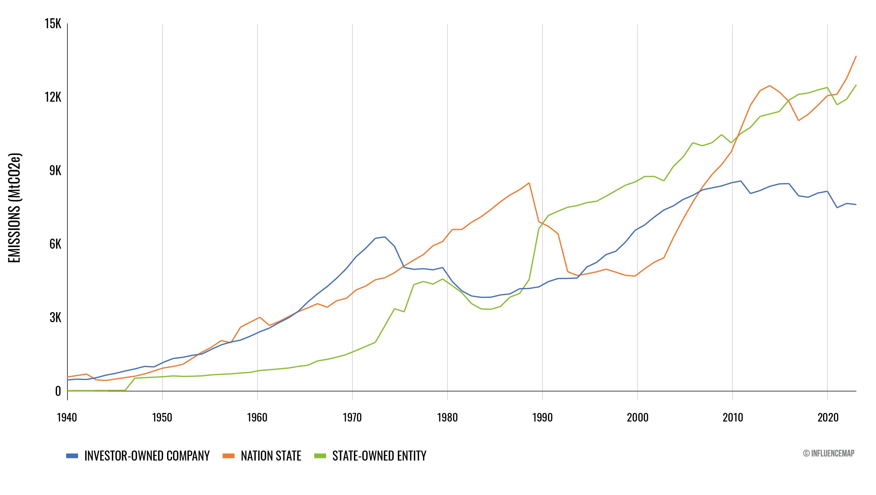
I regards to the graph you posted, it shows how emissions from private comps is have fallen and emissions from nations and nation owned companies have rissen. I think this is a relevant distinction to make, because the meme and the report as they are show a one sided picture (capitalism is the sole drive of climate change) whilst, looking at the complete data, a more nuanced picture emerges (like the role of nations in upholding the capitals system).
Yes and no. The Carbon Majors Report provides two ways of looking at global emissions: Cumulative and Annual. The table you showed reflects the Cumulative Emissions Since Industrial Revolution (1751-2022)
While not reported in the Guardian article, the same 2017 report stated 72% (p5) of global industrial GHGs in 2015 came from 224 companies, with the sample breakdown in the 2017 report, Appendix II (p15). As you can see, pretty much all of those producers are private/state-owned companies and much closer to the current picture of annual emissions. I’m not sure what counts as “industrial”, but crunching the raw numbers of 30565/46073 Mt (Global Emissions, statcan) it works out to about 66% of global emissions in 2015.
Why are you using data from the 2017 report?
You are referring to page 15, which shows emissions in 2015. In the up to date 2024 report this has been replaced with emissions after the Paris climate agreement, so 2016 till 2022.
As you can see, the same picture emerges as I stated in my first post: the top actors are Nations or state owned producers. The contribution to global Co2 emissions is listet, but still only refers to fossil fuel and cement Co 2 emissions.
Great question! The reason why I was using the 2017 report is that the Guardian arrival you originally referred to was from 2017, so I looked at the report they were working off of. While the article is still misleading (shame Guardian) the notion that a small proportion of companies, both state and private owned (100-200), are responsible for the majority (>50%) of global emissions.
Looking at the updated graph of annual emissions, it seems like this is still true, though I haven’t counted the companies. Again I agree the 72% figure is misleading, but I am pushing back on the alternative implication that relatively few companies are not actually making up the majority of annual emissions.
That is sensible, yes.
I regards to the graph you posted, it shows how emissions from private comps is have fallen and emissions from nations and nation owned companies have rissen. I think this is a relevant distinction to make, because the meme and the report as they are show a one sided picture (capitalism is the sole drive of climate change) whilst, looking at the complete data, a more nuanced picture emerges (like the role of nations in upholding the capitals system).