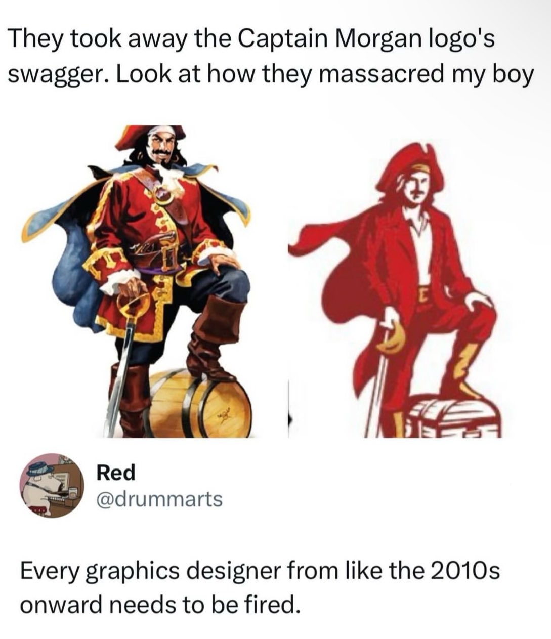
Say we’re cool with the aggressive simplification and even the costume change. Why the fuck is it drawn worse? What is that facial expression? You could obviously have captured his salacious grin, in the screen-print blob version, or at least got his fucking facial hair right. Is that cashew fruit under his mustache supposed to be a chin divot? It looks like he’s going “Oohh.” What is his right hand even doing? Is he holding that saber like a cane? Gripping the pommel, rather than resting a hand on it? You could have made him hold the sword, upside-down, and it’d imply an air of danger, rather than indicating he’s unaware how a sword works.
And let’s talk about the costume change. You want a more readable logo? Something you can shrink, without losing the shape of everything? Your mascot wears gold-trimmed clothing. There’s literally a fucking outline around his coat. It’s not a color limit thing. You kept yellow in the boots and such. But now he’s wearing a modern suit-jacket over a polo shirt. What the fuck? This isn’t an aspirational figure. This is a rude depiction of your target audience.
Also: rum doesn’t come in chests.
“This isn’t an aspirational figure. It’s a rude depiction of your target audience.”
I want you to know I really appreciated this line.
We aim to please.
No, that’s obviously a banana growing out of his hand.
Oh right, a side effect of Professor Farnsworth’s fing-longer.
That’s not a saber, sabers are curved. It’s a cutlass.
curved … swords?
Fair enough. Does that help explain why he’s using a pistol grip?
Probably osteoarthritis