

I appreciate the graphics that they post, but this one was… Bad.
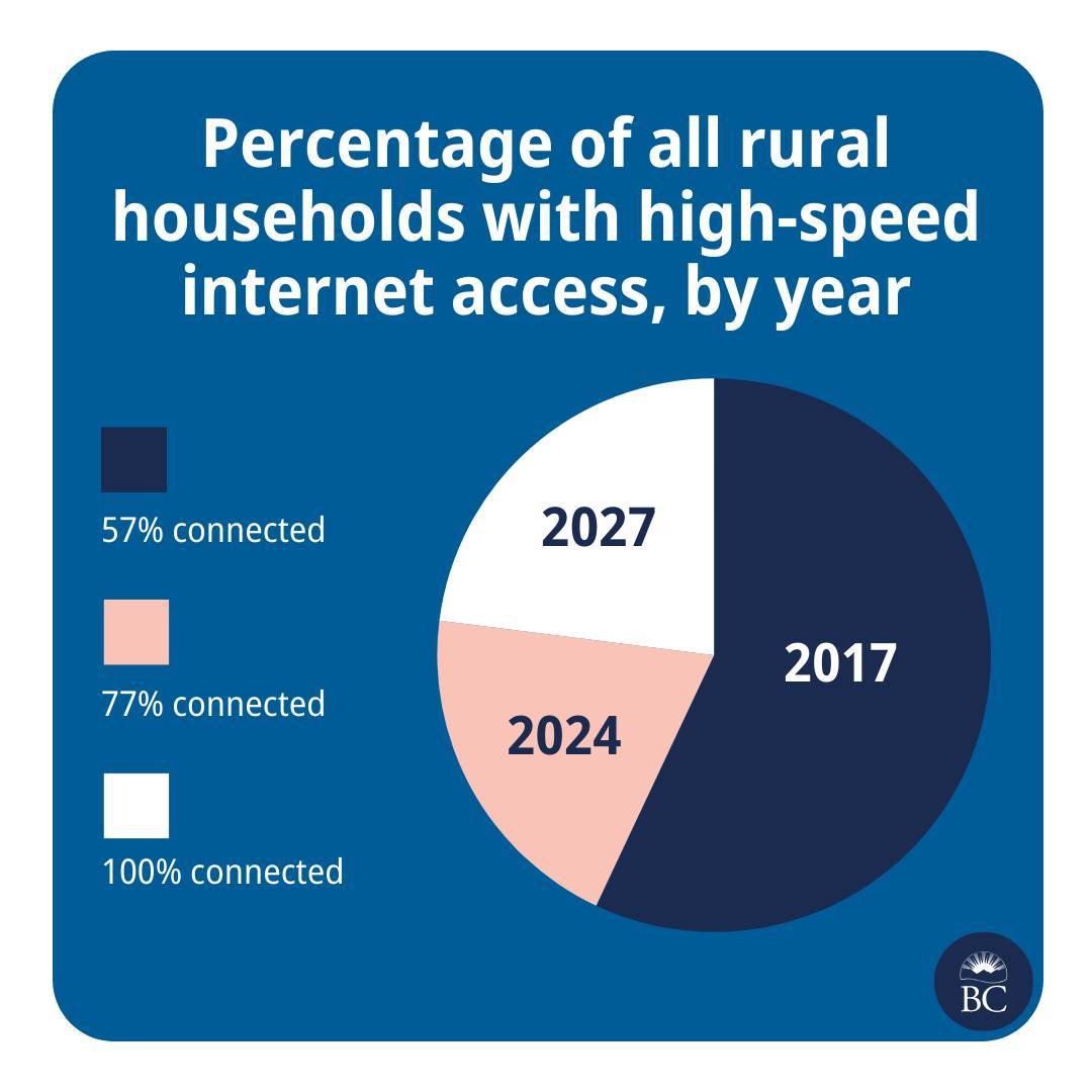
This is great news! And please also extend my deepest sympathies to whichever analyst was asked to cram this histogram into a pie chart.
They are taking the criticism in good faith though
Well, we’re taking a pie in the face on this one @[…]
We try to make info like this as clear as we can, @[…], but we don’t always get it right. Thanks for your feedback. We’re, uh, cutting ourselves a slice of humble pie.
The post: https://www.instagram.com/p/C7Pi4qAh72c/
Took me a minute, but it actually isn’t that bad. The size of the last two sections represent the additional % on top of the previous…
Having said that, there must’ve been a better, less confusing way to represent this data
I’ve always said bar or line, especially with time axis. In cases like this, you usually use a line as it usually isn’t linear growth anyway and you’d use a logarithm to predict where it’d be in 2027.
Of course they’re just bullshitting that 100% as real predictions wouldn’t ever get there.
yep line plot for sure.
The years aren’t equally spaced in time, and the future forecast should be clearly differentiated - maybe with a dotted line, or a high to low spread.
The graph hides how ambitious it is to more than double the rollout rate.
We should expect to see cost per year (or workforce or some measure of resources) aso more than doubling.
Presumably this is a funded a plan, not strictly a forecast, so it’s not unresonable to have accelerating growth, if more resources are going in.
If resources are constant, then yes I’d think diminishing returns wold shape the forecast.
You could easily improve it significantly by labeling the segments:
I think the way to go would be to give each slice a different radius, so you could see that they’re layered over one another.