

New GNOME dialog on the right:

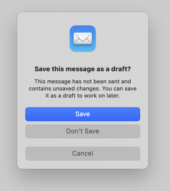
Apple’s dialog:
They say GNOME isn’t a copy of macOS but with time it has been getting really close. I don’t think this is a bad thing however they should just admit it and then put some real effort into cloning macOS instead of the crap they’re making right now.
Here’s the thing: Apple’s design you’ll find that they carefully included an extra margin between the “Don’t Save” and “Cancel” buttons. This avoid accidental clicks on the wrong button so that people don’t lose their work when they just want to click “Cancel”.
So much for the GNOME, vision and their expert usability team :P
I find that “carefully included extra margin” outrageously ugly
It’s ugly, but useful.
(unlike me, I am ugly and useless /s)
I have no idea about apple design guidelines and am not a UX designer, but wouldn’t a horizontal seperator look better? In gtk i would add one here, gives some extra space and more visual seperation.
Same
Looks alright to me.
I don’t completely disagree with you, however the cost of losing an important document because you clicked on the wrong thing is way higher than having to look at the extra space every day.