

New GNOME dialog on the right:

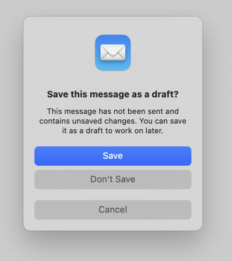
Apple’s dialog:
They say GNOME isn’t a copy of macOS but with time it has been getting really close. I don’t think this is a bad thing however they should just admit it and then put some real effort into cloning macOS instead of the crap they’re making right now.
Here’s the thing: Apple’s design you’ll find that they carefully included an extra margin between the “Don’t Save” and “Cancel” buttons. This avoid accidental clicks on the wrong button so that people don’t lose their work when they just want to click “Cancel”.
So much for the GNOME, vision and their expert usability team :P
That same logic could be applied for the save and discard button. Should there be a bigger gap between them lest somebody misclick and discard things instead of saving them¿? Atleast in the case where they accidentally click cancel instead of discard, they are not losing any data.
Hell if this really about data safety, discard/don’t save should be the isolated button because it is the only destructive option
According to the UX experts you don’t need the space between the save and discard buttons as long as the “save” is the first one. Missclick are more prone to happen from top to bottom than the other way around, so if the user wanted to hit “save” it’s more likely he will click above the button than it is to click “discard”. Same logic applied down there, when the using is looking to cancel it’s easier to missclick and hit the “discard” button than anything else.
Can you share any study for this. If this is true, it is fascinating and worth looking into in more depth
This is an application of Fitts’s law. I saw some paper referencing it to back that kind of margins on destructive actions but I don’t remember the title.
Well fitts law doesnt mention anything about asymmetrical spacing anywhere. Infact going by fitts law, the new gnome design is great because the hitboxes are pretty large
That’s what the paper was about, the law also applies the in reverse, adding the space protects the user because it makes it harder to click on the hitbox.