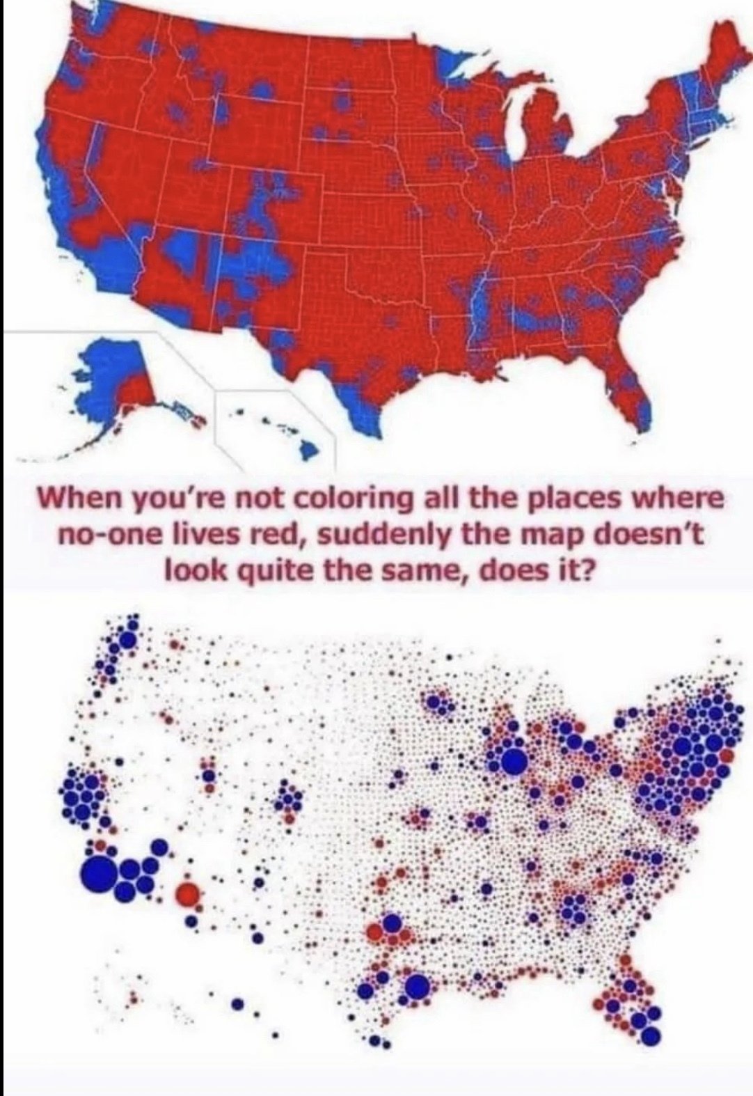
Thank you for actually understanding what the second map says. It’s shocking how many people in these comments were so easily fooled into thinking that is where the people live in the second map.
The other complication is that the second map is so potato you can’t see what color the smaller dots are and I think it gives overall a bluer impression than it would at higher quality.
They are probably coloring whole counties, where the second map just makes a dot for each country proportional to population.
Thank you for actually understanding what the second map says. It’s shocking how many people in these comments were so easily fooled into thinking that is where the people live in the second map.
The other complication is that the second map is so potato you can’t see what color the smaller dots are and I think it gives overall a bluer impression than it would at higher quality.