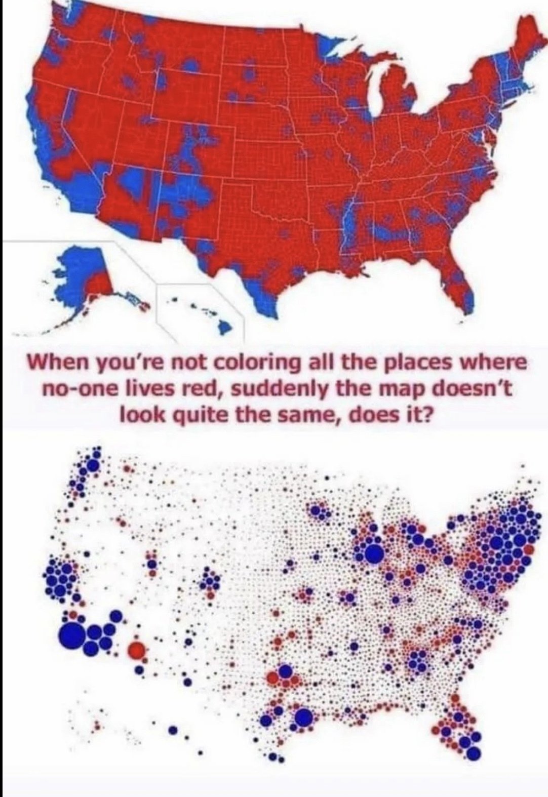
Frankly both of these maps are deceptive (though the top one is albeit more so). The dot gets colored the primary color in that region, and visually makes the Democrats seem way more dominant when it’s much more bipartisan. A gradient would make this map better

Frankly both of these maps are deceptive (though the top one is albeit more so). The dot gets colored the primary color in that region, and visually makes the Democrats seem way more dominant when it’s much more bipartisan. A gradient would make this map better
Yep, each area needs two dots, one red, one blue, sized proportional to their votes.
Florida will get quite a bit bluer, but California and the northeast will get much redder.
the jpeg makes a lot of the smaller dots look grey too
Removed by mod