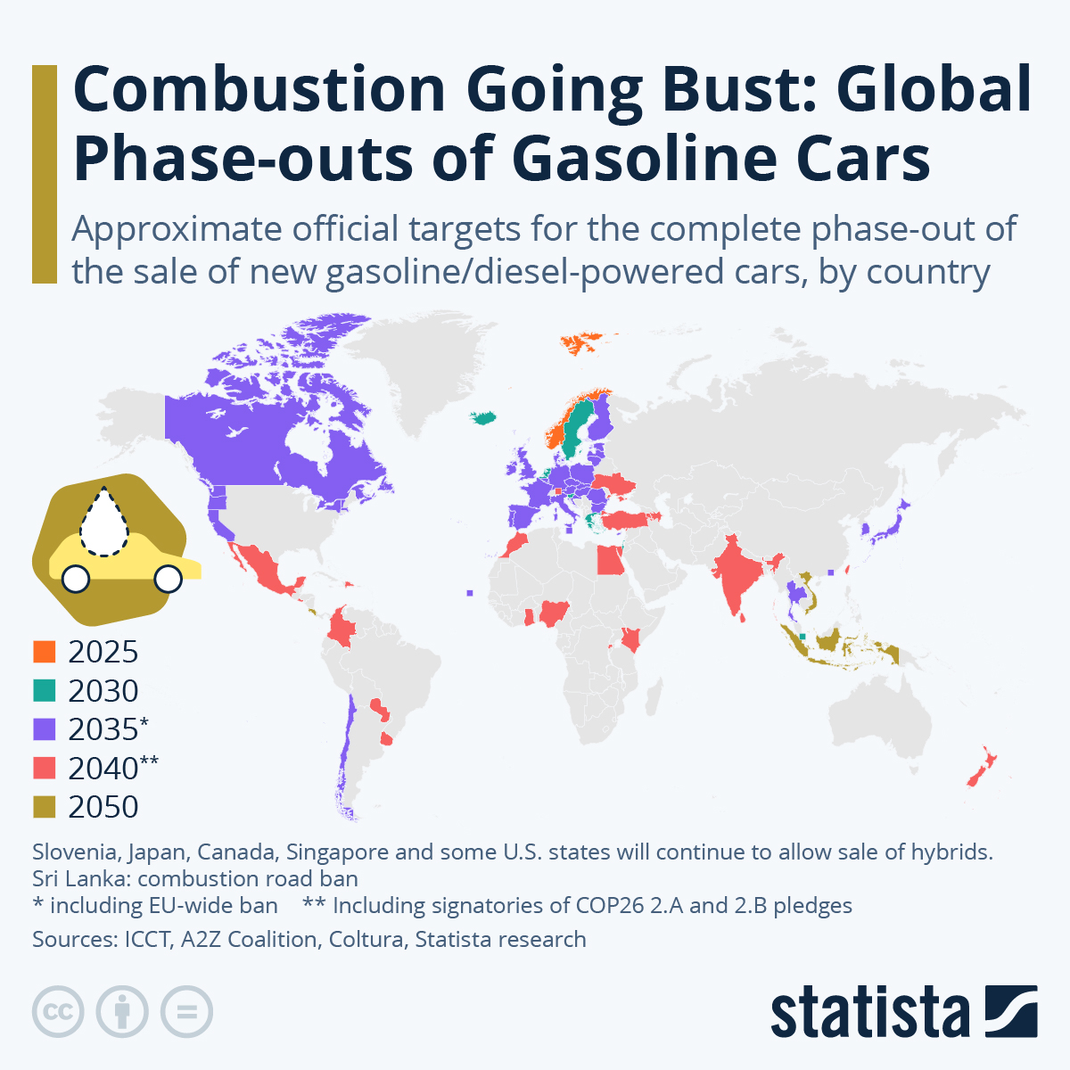
I guess depending on size and colour rendition of displays it can be easier / harder, but overall I’d still say it’s a poor choice.
A choice of different colours is OK, but specifically those 2 are pretty hard to distinguish. Simply changing one of them to black, which looks like no other colour used in the map, would be much better.
I don’t think a gradient works for colouring a map like this: we can distinguish gradient colours when they are next to each other, but if 2 countries far away have adjacent values the colours would probably be too similar to tell the difference.
A gradient is fine and even desirable for a small number of groupings like this, and allows you to see what order places are in without reference to a key. You just need to pick one created by people who know what they are doing rather than pulling colours out your butt.