

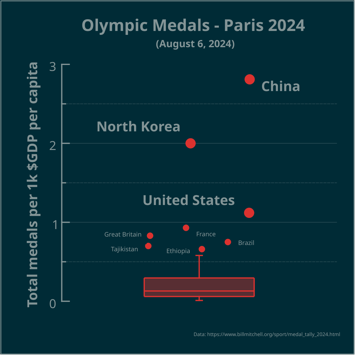
▶️ Total olympic medals per 1k $GDP per capita - Paris 2024 - represented in the Tukey’s boxplot 🏅
Is the highest number, relative to $GDP per capita, best? Outliers marked as circles. Made in #LabPlot, an open-source data analysis and visualization software.
Edit: the problem is framed as a question.
#Olympics #Olympics2024 #France #China #NorthKorea #USA #UnitedStates #UnitedKingdom #UK #Brazil #Australia #Japan #Italy #Canada #Germany #Spain #DataAnalysis #DataViz
This really looks like the horizontal distribution is meant to mean something even though it’s a 1D plot
@smeg
The points are jittered along the x-axis, otherwise the data points could overlap.
Maybe it’s because it’s stretched relatively wide, I assume that’s to make the whole graphic a square?