The much-anticipated DOOM 2 Ray Traced mod, which has been in the works for several years, is now available for download. This mod not only features complete path tracing but also transforms all 2D sprites into voxels, endowing the models with a more three-dimensional appearance. To run this mod, simply obtain GZDoom, allowing you to experience DOOM 2 in an unprecedented way, complete with global illumination, ray-traced shadows, voxels, and fluid-based blood simulation. It is compatible with the latest versions of Doom 1 and 2 on Steam, as well as the original WAD files. Download it here now. https://www.youtube.com/watch?v=0mhdGeQ9NHo

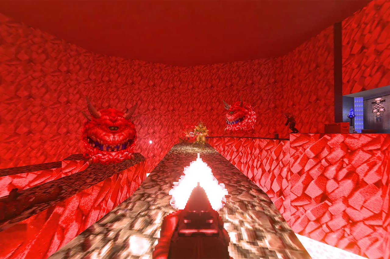
It would benefit from tone-mapping that’d look goofy anywhere else. The original games were as metal as possible back when that meant edgelord comic books and airbrushed album covers. Even the darkness is garishly colorful. It’s bright enough to let you see it’s dark. At the same time, there’s no 80s-cartoon bloom… even though the original games probably could’ve done it by extending the colormap upwards. The result is a very readable, very flat image. It has high information.
So to capture that feeling, all the super-bright stuff should fall off rapidly, and all the super-dark stuff should brighten rapidly. Reduce contrast. The inverse of the S-curve that produces cheap spooky overexposure in a sea of black. In this application that’s probably justified, since the scene is lit exclusively by hellfire, but there’s better options than accuracy.
If the game was designed for this lighting model there’d be more light sources and they’d be more dynamic. Doom 3 only had direct shadows and they went hog-wild. Even Quake’s lava spat rocks, just to make the lightmaps less static. With atmospheric scattering and indirect lighting, every caco cloud should have gratuitous cones of shadow, either from a wall that’s been promoted to a lightsource, or from some new pendulous chandelier.
Emissive surfaces probably need to be sharply attenuated by their textures. Especially on lava, only the bright parts should be bright. You should not look down at cracked magma and only see off-white. It deserves to look redder than red.