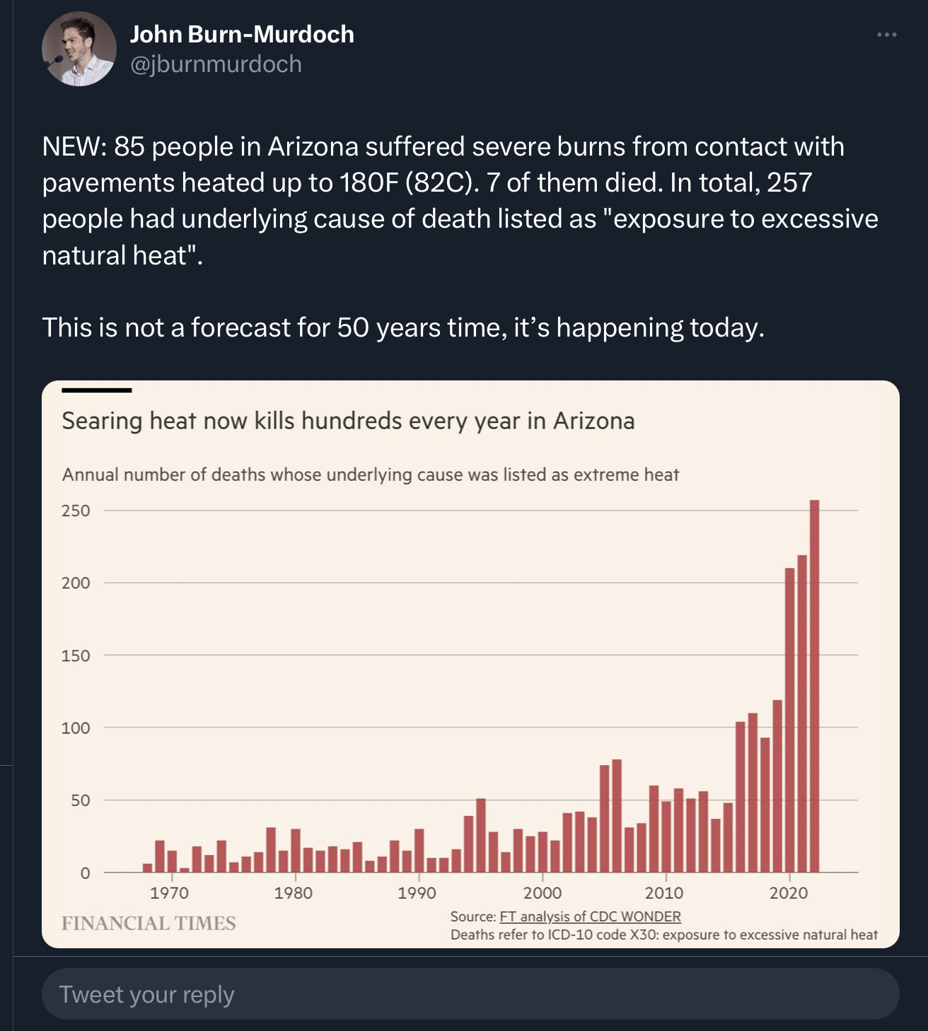
And whenever you have a chart of historical data like this, you have to at least consider that an increase could be reflective of either improved diagnostic or record-keeping abilities.
More like you just died from old in 1970, versus acute heat stroke in 2023.
I say this being fully on board with the climate change. Charts like this serve little purpose when you don’t properly adjust for the myriad changes that have occured over the last half century. And before anyone says “you mean like global warming,” no, don’t account for that one, because that’s what we’re trying to see.
Yeah, it can be as simple as the death certificates requiring only a primary cause of death.
Old man collapses from a heart attack while trying to change a tire on a hot desert road? Cause of death: heart attack. If more details are requested, they could probably get away with just claiming age-related health issues. The guy is dead, no foul play, the case is closed.
Very much this, and especially over this period. More universal diagnostics, more emphasis on secondary causes and contributors, etc.
And it works the other way, too. Fewer people should die per capita based on faster EMS response times, better medicine, more urban living, etc.
The big one for me is age. I never really heard of people retiring to Arizona until the late 90s. It was always Florida before then. The over 50 crowd is 36% now vs 23% in 1970.

And whenever you have a chart of historical data like this, you have to at least consider that an increase could be reflective of either improved diagnostic or record-keeping abilities.
If we stop testing we will have 0 cases!
More like you just died from old in 1970, versus acute heat stroke in 2023.
I say this being fully on board with the climate change. Charts like this serve little purpose when you don’t properly adjust for the myriad changes that have occured over the last half century. And before anyone says “you mean like global warming,” no, don’t account for that one, because that’s what we’re trying to see.
Yeah, it can be as simple as the death certificates requiring only a primary cause of death.
Old man collapses from a heart attack while trying to change a tire on a hot desert road? Cause of death: heart attack. If more details are requested, they could probably get away with just claiming age-related health issues. The guy is dead, no foul play, the case is closed.
AKA the conservative COVID strategy.
Finally, someone gets it. We just need to ban thermometers.
The libs are making us slaves to those damn thermomasters! They better not take away my freedom to boil off those 3 remaining brain cells!
Very much this, and especially over this period. More universal diagnostics, more emphasis on secondary causes and contributors, etc.
And it works the other way, too. Fewer people should die per capita based on faster EMS response times, better medicine, more urban living, etc.
The big one for me is age. I never really heard of people retiring to Arizona until the late 90s. It was always Florida before then. The over 50 crowd is 36% now vs 23% in 1970.