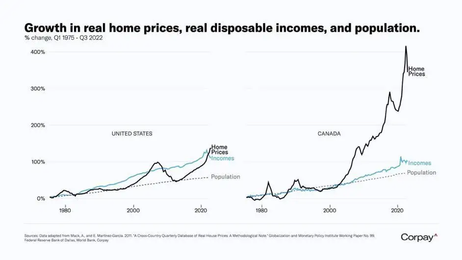
Cows Look Like Maps to Data Is [email protected] • 10 months agoComparison of population, wage, and home price growthimagemessage-square35arrow-up1349arrow-down17
arrow-up1342arrow-down1imageComparison of population, wage, and home price growthCows Look Like Maps to Data Is [email protected] • 10 months agomessage-square35
minus-squareCosmonaut_Collinlinkfedilink8•10 months agoThis graph would look much different if it compared home prices in 2022-2023.
minus-squareCosmonaut_Collinlinkfedilink1•10 months agoHome in the US shot up in price around the end of 2021 and peaked earlier this year. I wonder how the comparison looks after that spike.


This graph would look much different if it compared home prices in 2022-2023.
What do you mean
Home in the US shot up in price around the end of 2021 and peaked earlier this year. I wonder how the comparison looks after that spike.