I think at one point a cursive S was “draw an S without lifting your pen from one letter to another” so it comes out looking a bit like an 8. Then the top loop got smaller and smaller, until the one guy who codified the cursive alphabet just didn’t put the top loop on at all.
This same guy for some reason decided capital Q should look like a 2.
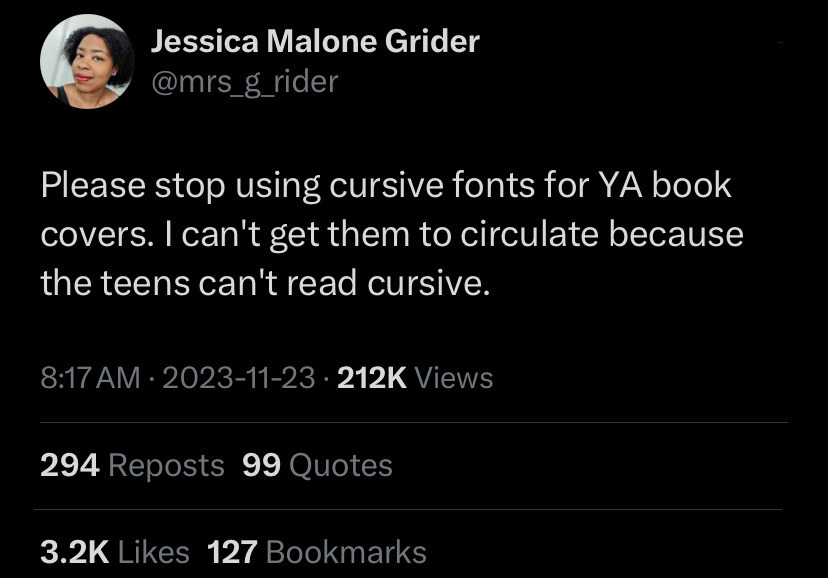
If I were in charge of the curriculum, students would get an introduction to cursive and an afternoon playing with it, basically so they can recognize it as a “font” and read it. Then let them continue to print or more likely type their work.

I think at one point a cursive S was “draw an S without lifting your pen from one letter to another” so it comes out looking a bit like an 8. Then the top loop got smaller and smaller, until the one guy who codified the cursive alphabet just didn’t put the top loop on at all.
This same guy for some reason decided capital Q should look like a 2.
If I were in charge of the curriculum, students would get an introduction to cursive and an afternoon playing with it, basically so they can recognize it as a “font” and read it. Then let them continue to print or more likely type their work.