
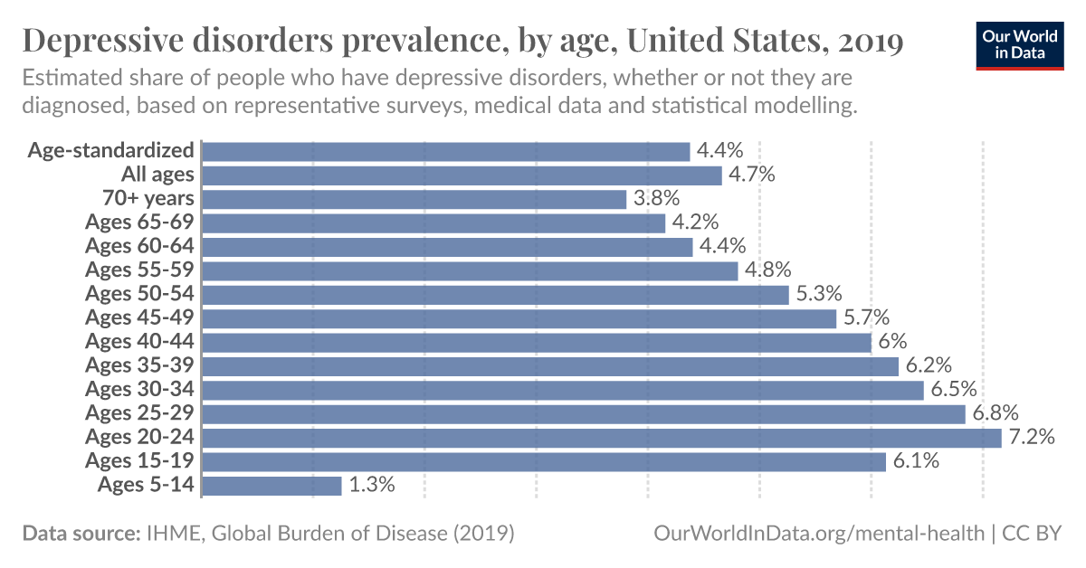
Different countries have different distributions, click “change”. Canada, Australia, New Zealand have similar to the US. France, Germany, UK peak 40-44.
Different countries have different distributions, click “change”. Canada, Australia, New Zealand have similar to the US. France, Germany, UK peak 40-44.
Because on everyone else’s chart it gets better with age, in Germany it looks like you’re just fucked for life.
Only because it scales relative to the maximum value, it looks worse at a glance when it’s actually notably better.
The maximum value is the population, as a percent of society it doesn’t get better.
deleted by creator