
Criticism is welcome!
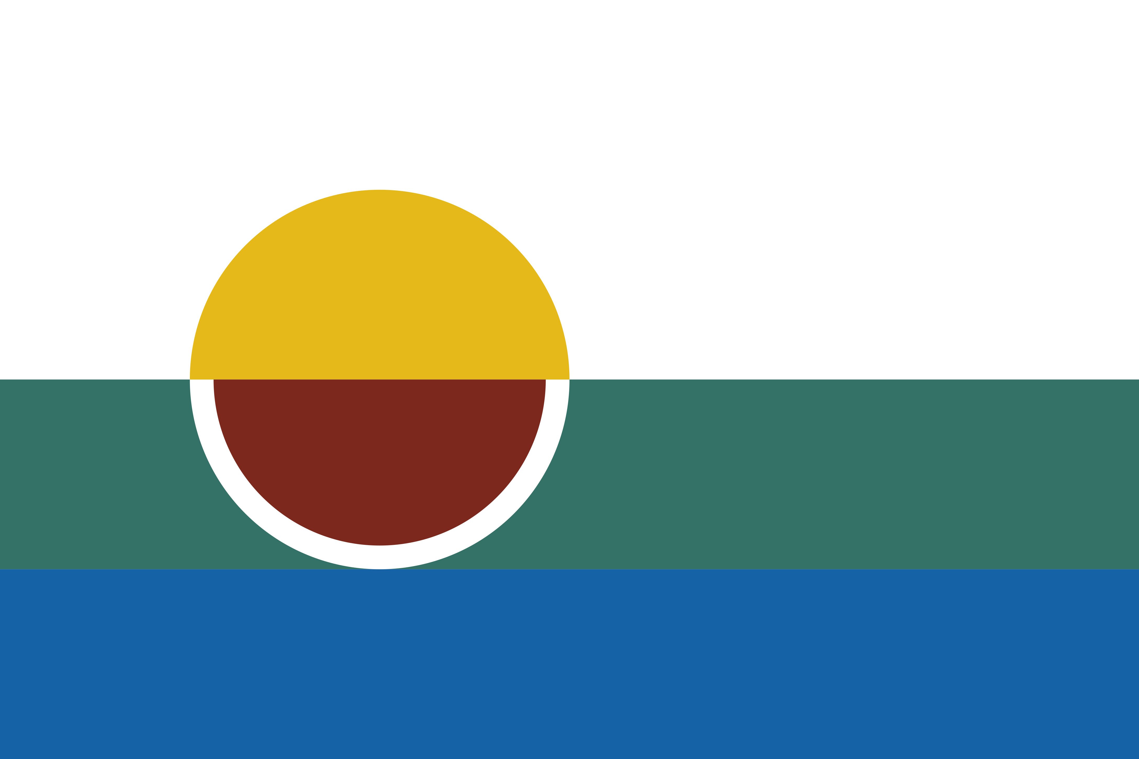
Symbolism breakdown:
- The gold semicircle represents the rising or setting sun, a symbol of change. Morrilton is currently growing after a period of decline, so this sun represents the glories of the past and of the future.
- The white field represents a blank slate, the city’s enormous potential to grow. It also represents the sense of morality and community that binds its people together.
- The green band represents Petit Jean mountain just outside the city, and the semicircular cutout represents the Arkansas River Valley which encompasses Morrilton and many of its neighbors.
- The ruddy semicircle with white border represents a wine glass; Morrilton is the seat of Conway county, where the sale of alcohol is allowed, surrounded by dry counties to the east, north, and west. The color also represents Morrilton’s 3 major educational institutions (UACCM, SCCSD, and Sacred Heart) all of whose primary school colors are a shade of red.
- The blue band represents the Arkansas River, on whose shores the original settlement was built. This further represents the rich history of the city, as well as the past and present flow of trade along the river, railroads, and I-40.
I feel somewhat confident in the geometry of this design, but I don’t know anything about color theory so I’m open to suggestions on that. The present colors were picked with the help of an AI, followed by some mathematical derivation using software and hand tweaking.
Lol