
Criticism is welcome!
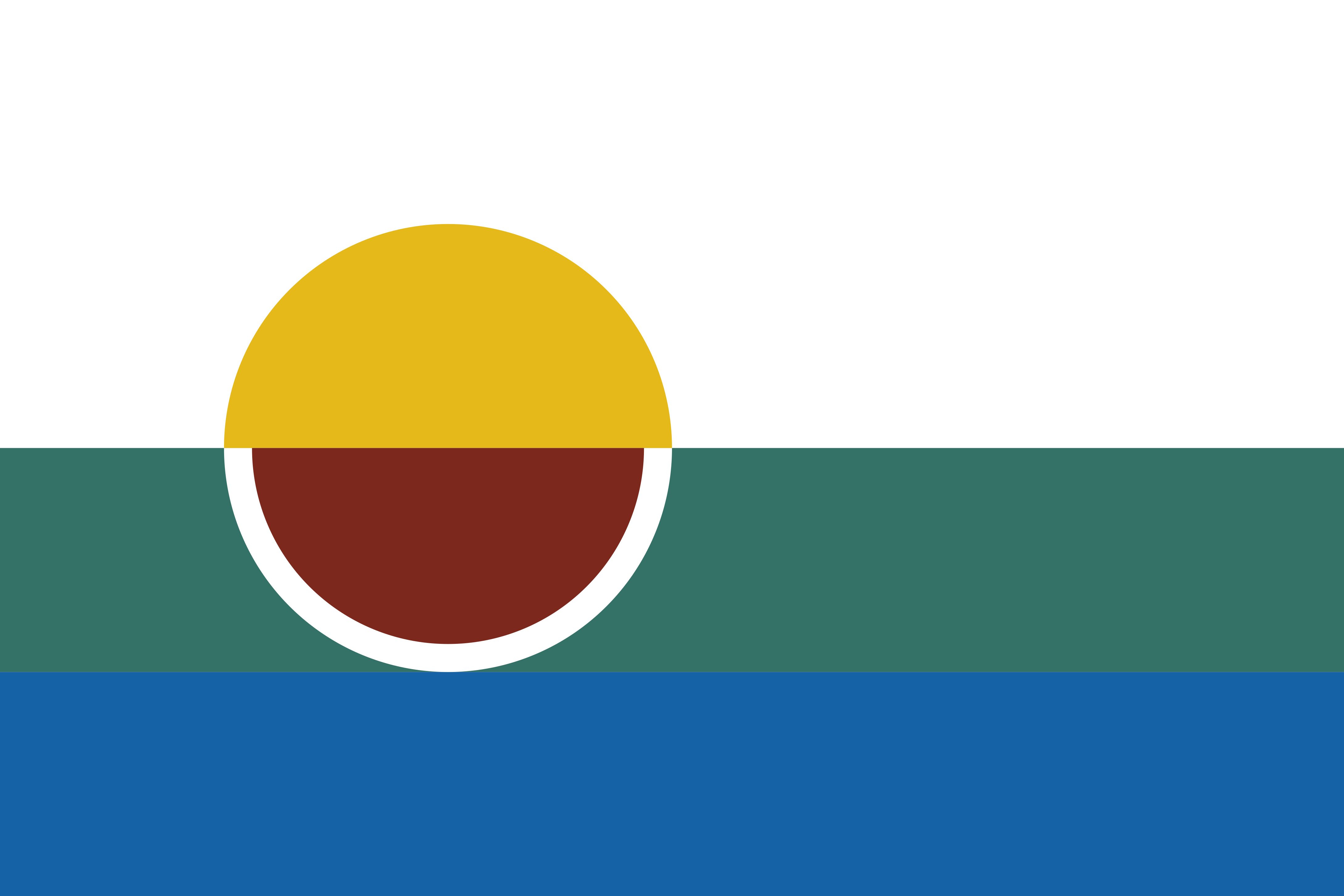
Symbolism breakdown:
- The gold semicircle represents the rising or setting sun, a symbol of change. Morrilton is currently growing after a period of decline, so this sun represents the glories of the past and of the future.
- The white field represents a blank slate, the city’s enormous potential to grow. It also represents the sense of morality and community that binds its people together.
- The green band represents Petit Jean mountain just outside the city, and the semicircular cutout represents the Arkansas River Valley which encompasses Morrilton and many of its neighbors.
- The ruddy semicircle with white border represents a wine glass; Morrilton is the seat of Conway county, where the sale of alcohol is allowed, surrounded by dry counties to the east, north, and west. The color also represents Morrilton’s 3 major educational institutions (UACCM, SCCSD, and Sacred Heart) all of whose primary school colors are a shade of red.
- The blue band represents the Arkansas River, on whose shores the original settlement was built. This further represents the rich history of the city, as well as the past and present flow of trade along the river, railroads, and I-40.
I feel somewhat confident in the geometry of this design, but I don’t know anything about color theory so I’m open to suggestions on that. The present colors were picked with the help of an AI, followed by some mathematical derivation using software and hand tweaking.
I’ll miss the land or water if I have to choose one… Maybe some ambiguous teal to be both? Or I could do a much darker green against a lighter blue.
Definitely gonna apply all your other suggestions.
Yeah, there might be a way to make it work by fiddling with color values. Green next to blue can be tough, but it’s not impossible. The trick will be finding a green and blue that are also complimentary and don’t create a pallet that looks like a McDonald’s ball pit.
If you’re new to color theory, do a Google search for color theory / color pallet tools. There are a lot of good ones out there. Adobe has a nice free one.
You might also be able to represent land another way. Like using a shape or illustration instead or color.
That said, as someone who’s been doing this for few decades now and directs some design teams, my advice is to keep symbolism to like 2 or 3 things. One you go over that, it can really be easy to get messy harder to pull off. Just my 2¢.
That said, I like where you’re going with this. Will this be officially adopted by the area?
Point taken.
I certainly intend to try and get it in front of the council, but they weren’t actively looking to get a flag. Folks around here can be hesitant to change, so I’m not getting my hopes up.