
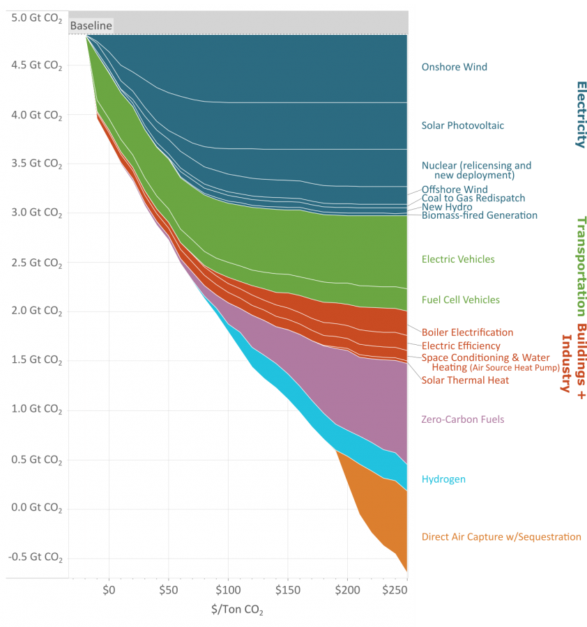
As you reduce the amount of carbon emissions (the y axis) the methods to keep reducing carbon cost more (the x axis.)
This great graph came to my attention from this video from vlogbrothers. It also has some good explanations of what it means.
Note that carbon capture doesn’t really make sense till you’ve exhausted all the other emission minimizing methods.
Source: https://www.edf.org/revamped-cost-curve-reaching-net-zero-emissions
Okay, since this is referring to the global co2 emissions, global scale makes sense.
But is it? Does it?
No it doesn’t, not the way this is being presented. The axis need to be relabeled and rearranged to represent that. Just accept that this is a poor presentation of these data.
The y axis is the global co2 emissions. Where are you getting that it isn’t?
Lol.
No it isnt.
Average annual emissions are 10gt per year right now.
Y here is ‘cumulative’ carbon offset capacity (which is a bit of a misnomer because in their method you ‘stop’ doing things that are ‘cheaper’ at lower cost per unit carbon, which is like, not a good assumption to make, but we’ll stick with it for just trudging through this disaster of a figure).
This is why data presentation matters. People who don’t know what they are talking about or how to understand these things will make the wrong conclusions.
Hmm actually looks like this is only the US. The 5gt is from 2021 when it was published. Yeah that should have been more clear.
But its not just that. Its x axis is in Mg/$.
The figure and the thinking behind it need a complete rework. They would have been better off sticking with the original McKinsey presentation of this concept from 2007.
They’ve made it worse.
Looks to be like the x axis is $/ton? If the original figure is better, could you link it so I can replace the pic?
The originally figure is literally in the article you linked.
This one?
Yes. That’s the original MAC curve the travesty you posted is supposed to represent an improvement to. It comes from Mckinsey 2007.
Y is cost per ton (x in the figure you presented). X is the potential reduction capacity of a given activity. Think about it like this: If Y were the price a carbon tax in Mg, the value of a tax is where a given activity becomes break even. Once carbon is ‘priced’ at a given level on Y, the activities below it on X become cost neutral/ cost savings. Negative numbers on this figure represent a real savings right now, with effectively a negative price on carbon. We should do these things right away. Positive values have a ‘cost’ associated with them (afaik, this doesn’t account for the fact that fossil fuels are subsidized). If we ‘taxed’ or put a price on carbon, the values where that line intersects and below become cost-neutral or a savings can be realized.
It doesn’t look like you can find an optimal mix of methods for a particular reduction though.
I mean there are two approaches we can take here. One is to go after their methods, and the second is to go after their presentation of the data. What they aren’t clearly stating is that this is a supposed optimization around sequestration capacity, because its implicit to their methods. This has so many assumptions baked into it, it doesn’t even make sense to begin unpacking them. The biggest are assumptions around saturation. Like if carbon was being priced at 150 a Mg, not a soul on the planet is going to be bothering with DAC when you could plop down solar panels in Finland and still make a profit.
But this isn’t ‘method is beautiful’ this is data is beautiful.
All they needed to do to improve the MAC curve was add a cumulative sum curve on a secondary axis. Honestly, just swapping X and Y might be enough to save this… this ‘thing’ they’ve created.