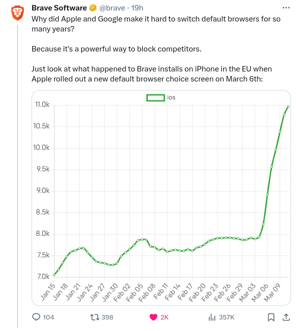
Yes but the graph goes from 2 rectangles above the bottom line to 8 rectangles above the bottom line in that final surge.
So visually, it looks like it has quadrupled.
While I agree for the sake of clarity, a bigger problem is that it only goes back less than 2 months. Has the number of installs been steady at 7k for a long time? Or does it fluctuate wildly like this occasionally for reasons totally unrelated to laws?
I was just clarifying the original comment about the baseline not being 0.
Tbh, I hadn’t even looked at it properly and only noticed now that the timeline isn’t one month per box.


deleted by creator
How so? It goes from ~7 to ~11. That’s not even x2.
Yes but the graph goes from 2 rectangles above the bottom line to 8 rectangles above the bottom line in that final surge.
So visually, it looks like it has quadrupled.
While I agree for the sake of clarity, a bigger problem is that it only goes back less than 2 months. Has the number of installs been steady at 7k for a long time? Or does it fluctuate wildly like this occasionally for reasons totally unrelated to laws?
I was just clarifying the original comment about the baseline not being 0.
Tbh, I hadn’t even looked at it properly and only noticed now that the timeline isn’t one month per box.