
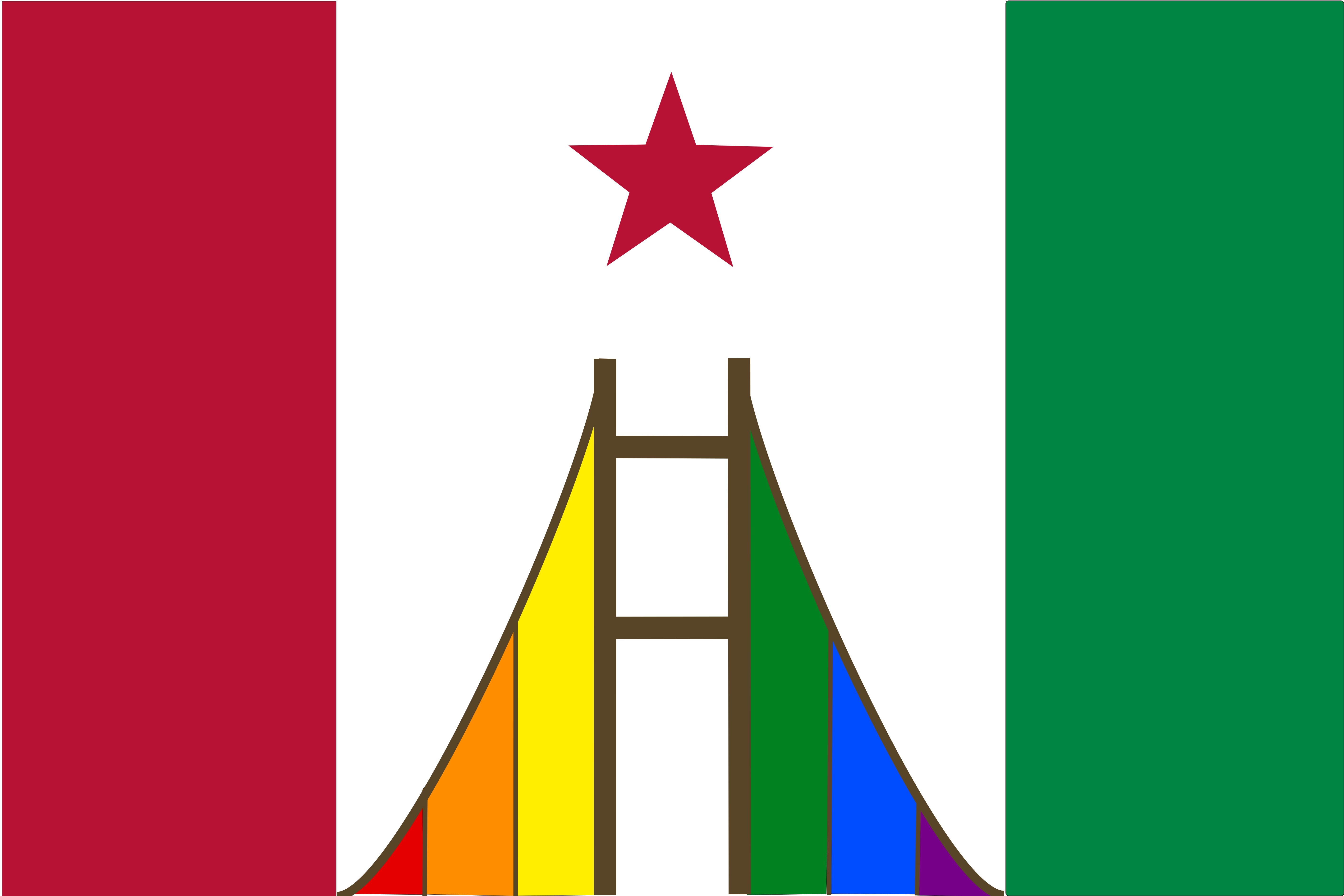
It’s a low bar to make the California flag better, but I woke up and decided to give it a go. It’s my first attempt. Let me know what you think
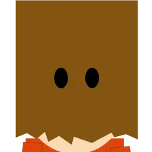
You woke up today and chose violence. Leave my bear alone D:
Unfortunately I was born too late to do violence on the bear. It’s now extinct in California :(
In my opinion - places the bear belongs: in the Californian wilderness. Places it doesn’t belong: on the flag.
San Francisco bears are far from extinct and we will fight to protect them and keep them enshrined on our flag.
San Francisco bears are not what’s depicted on the flag (or did I miss the assless chaps, ball gag and leash?) The flag would be better with one.
Went directly for the kill, didn’t ya?
Wrong.
Setting aside whether the California flag needs a wholesale overhaul or just have the words removed, the Canadian pale tricolor here is an interesting concept. What’s irking me the most is the bridge, which is very prominent on this flag, but there’s enough missing from the rendition that it bears almost no similarity to the most famous bridge in California.
The Golden Gate Bridge has towers in an Art Deco style. I’m not an art student, so I can’t really describe what makes it Art Deco, but the prominent detail are the flutes which extend up alongside the tower, tapering off. From the side, it would make the tower somewhat blockish. Often times, a stand-in for the GGB is the Guy West Bridge in Sacramento, which is a smaller suspension bridge and has no Art Deco flares.
The other issue is the number of cross arms. Both the GGB and Guy West have four evenly-spaced cross arms, whereas here there are only two, with a large space where a third one should be but isn’t.
Please don’t take this as a personal dig at this rendition, but California is not particularly known for bridges generically – although our other, less famous bridges are becoming infamous – but instead for one very particular bridge, and possibly its adjacent bridge, the Bay Bridge. In fact, the latter’s new eastern span graces the flag and logo of the Golden State Warriors, rendering it in profile, rather than the view from the bridge deck itself. I would consider rendering the GGB if you’re going to feature a bridge.
On that final point, most people – tourists, locals, TV and film camera operators, etc – view and appreciate a bridge from afar. Suspension and cable-stayed bridges are exceptions, but a flat-top bridge is almost entirely unremarkable while traveling over it, but is gorgeous when viewed from another vantage point. The Foresthill Bridge in Gold Country is entirely mundane to drive or ride on, but is breathtaking as the tallest bridge in California, viewed from helicopter above or from the river below.
I don’t have the artistic skill to rendition the Golden gate bridge. I don’t think a detailed rendition would work for a flag anyway. You’d run into the same problem as the bear.
If you have the skill, I’d love to see that option though.
The first thing that sticks out to me, is that there are too many colours.
Red 1 (stripe/Star)
Red 2 (bridge)
Orange
Yellow Green (stripe)
Green (bridge)
Blue
Purple
Brown
White
BlackEdit- there was one less red than I thought.
Red 1 and 2 are the same. The brown of the bridge and green are from the current flag. I just added the six rainbow colors. There is no black or yellow green. Maybe it’s too much.
Sorry, you are right about the reds. But there is a black line between the red and white stripes, and there is yellow and green in the rainbow.
I’m not sure what the correct number of colours would be, but 11 is probably too many.
But your flag doesn’t have any words on it, which is a vast improvement over the current California flag.
Red, white, green brown + 6 rainbow colors = 10 (probably too many anyway) But I like the rainbow motif for California. I like it’s contrast with the white (for the white supremacists that still call this state home).
No black between red and white (at least not intentional).
!wave
Here you go: Link
Beep Boop I’m a bot. Maintained by Thomas Douwes
Did I get something wrong? if so please message @[email protected]

