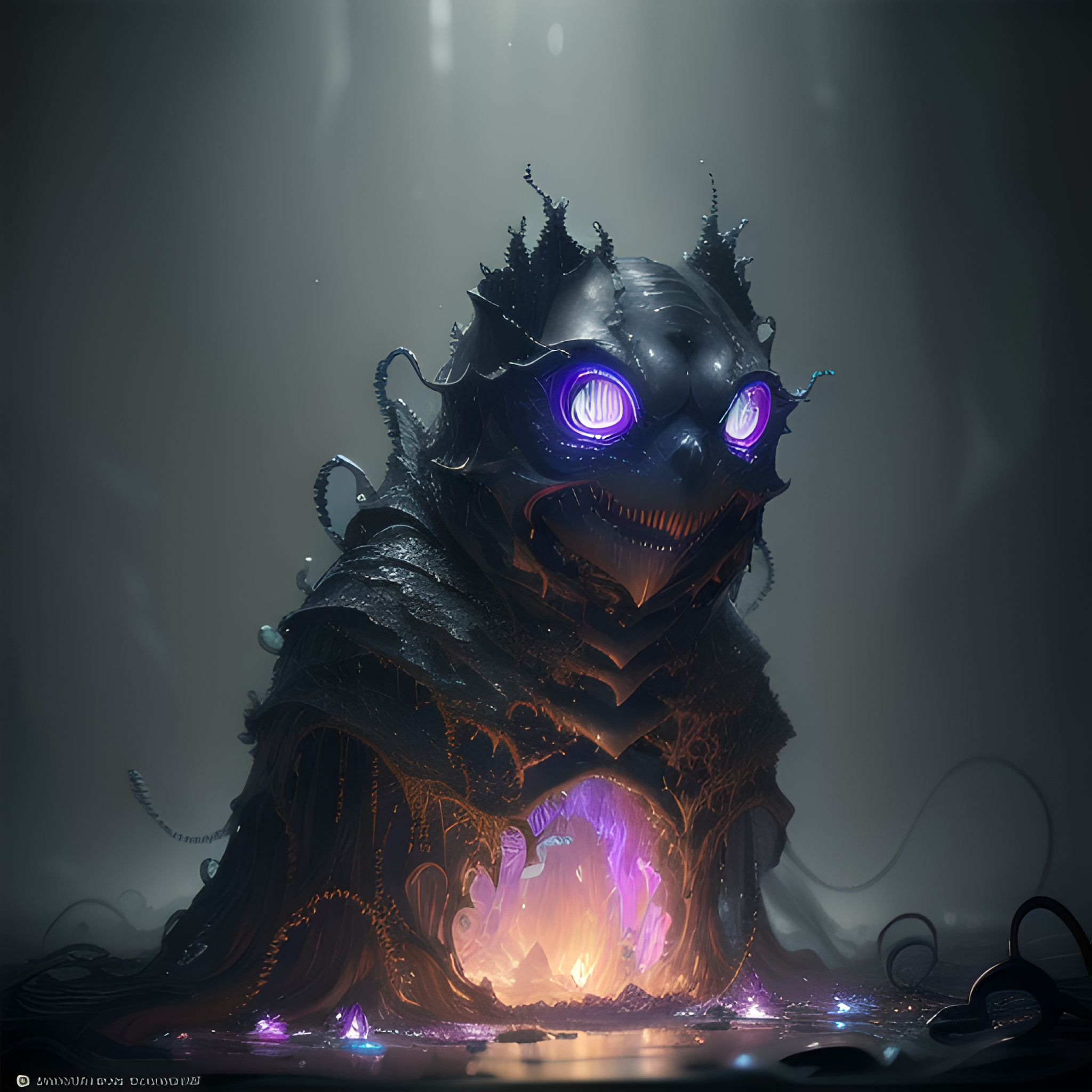
These are earlier generations of my previous post but without the forced “((anthropomorphic shapes)), ((big eyes))”. Extras will be in the first reply.
spoiler
parameters
Eldritch abomination, amorphous shapes, chaotic forms, unsettling textures, whispers from the void, haunting emanations, shadowy depths, incomprehensible horror, eerie, otherworldly, grotesque amalgamations, impasto, glazing, scumbling, chiaroscuro, (bundle of glowing fiber optic cables:1.3), epic realistic, art, (hdr:1.2), (muted colors:1.2), pastel, hyperdetailed, (artstation:1.5), warm lights, dramatic light, (intricate details:1.2), vignette, (photo-realistic:1.2), (Insanly detailed:1.2), (bloom:1.3) , (((CGI))). Negative prompt: poorly drawn, bad anatomy, wrong anatomy, extra limb, missing limb, disconnected limbs, mutation, mutated, ugly, disgusting, blurry, cropped, asian, text, (worst quality, low quality:1.4), watermark, signature, logo, monochrome, black and white,
Steps: 40, Sampler: Euler a, CFG scale: 7, Seed: 4108113490, Size: 512x512, Model hash: f8bb2922e1, Model: revAnimated_v122, VAE hash: ab33ad55c6, VAE: clearvae_v23.safetensors, Version: 1.6.0
postprocessing Postprocess upscale by: 4, Postprocess upscaler: R-ESRGAN 4x+
Why would a Borg need such perfect breasts? Not that I’m complaining…
Reduces resistance to assimilation, while it is true that resistance is futile reduced resistance leads to higher efficiency
Love this reply!
Picard: Get the Borg on comms now!
Borg:
Riker: We submit beam us over
Make sure you’re using the right VAE for this model. Your images look washed out and a little blurry.
These are the VAE the page for ReV Animated says you should be using
VAE:
Thanks @[email protected] I will check those out!
I thought the fuzzy effect might be coming from the up-scaling but it didn’t make any sense why it would.
For anyone curious what the correct VAEs adds.
kl-f8-anime2 adds a lot deeper colour and looks really nice.
With kl-f8-anime2

With blessed2

With Orangemix

Extra Images from the same prompt.
The Fortune Teller:

The Guardian:

The Corrupt:


I’m not sure if it was intentional or not, but in all of these and the one from the previous post stable diffiusion made them look like they are made of burnished steel; it looks very nice and actually fits very well
Edit: spelling errors
Amazing details, well done!

