Please report bugs using the following format in your title.
[] Issue here
Hi again, your app is getting better and better on each release, thanks! Today I would like to report:
spoiler
It seems spoilers doesn’t work on Bean yet
Build 2023.07.20.22.51 is currently rolling out to TestFlight users.
Changelog
- Added font size options to the Display settings.
- Added OpenDyslexic as a font choice.
- Added a setting to turn off haptic feedback.
- Added the ability to upvote and downvote comments.
- Added the ability to reply to a comment.
- Added the ability to pull to refresh on an individual post.
- Added options to show avatar and OP / Admin badges on comments.
- Fixed keyboard not showing automatically when adding a new comment.
Also seems like you’ve decided to keep the toolbar displayed at all times. I think I do prefer the toolbar displayed, so thanks for it!
Incredible work on the app.
Here are a few things I noticed:
- swiping media away is sticky and doesn’t carry momentum.
- collapsing comments doesn’t seem to work (apologies if this hasn’t been implemented yet)
Collapsing comments doesn’t seem to be a feature yet. But +1 for it.
The hacker theme looks so amazing. Thank you so much. Let me know if there is a link to donate. Would be more than happy to do so
Changelog August 2nd
Build 2023.08.02.01.29
- Added Toebean icon pack designed by my friend Noah (Instagram)
- Improved GIF -> JPEG representation rendering to only do it on animated GIFs.
- Fixed cut off text on Markdown lists.
- Fixed bookmarking.
- Added a loading indicator when navigating to a federated community.
- A toast is now show if a community cannot be loaded.
- Added a basic empty state to the inbox.
- Added the ability to block or unblock a community.
- Added a notice when a community is blocked and the ability to view it anyway.
- The image viewer can now be dismissed by swiping up.
- Added loading indicators for images.
- Fixed post title not showing on comments in the user profile.
Hi Steve,
A small [ BUG ] i want to bring to your notice, I’m still not able to see my bookmarks after reinstalling the app and I’m on the latest build,.
Otherwise the the app feels very snappy and polished already.
And I love the new set of icons too.
Thanks and appreciate your time and hard work on this.
Thank you! Out of interest, do you have Hide Read Posts on?
It’s OFF by default.
Yeah I know, I just haven’t been able to replicate it on my side and that’s the only thing I could think that might cause it.
deleted by creator
I am seeing the time stamp on some comments and the posts when sorting all by new as into the future 4 hours from now.

Same. Also I do not see a way to either leave a comment or make a post. I had to switch back to Memmy to leave this reply.

Changes: July 25th
build 2023.07.26.00.32
- Added the ability to create a post from community screens. This will be improved in upcoming builds with the ability to upload images and also select which community you wish to post to. Please test it in the meantime though.
- Switched to using the large title style for the nav bar and added an option to the Display settings toggle it off.
- Pulled out comments on user profiles.
- Added an option for Full Screen Swipe to Go Back to Actions settings.
- Added options to the Actions settings to hide floating action buttons.
- Added an option for the comment line width.
- Added an option to the Filtering settings to unbar NSFW images. For science.
- Fixed the incorrect background colour on the Search screen.
- Fixed some visual issues with the image gallery.
- Fixed visual issue with long community names.
- Fixed issue where sometimes the large title would not collapse correctly.
- Fixed an issue that could cause the wrong account to load on the Account tab.
- Fixed an issue that caused the count and vote not to show correctly on the single post view.
- Fixed an issue that allowed you to tap through to your own profile from your profile screen.
A couple more fixes are incoming:
- The weird layout issue caused when tapping a username in the comments.
- GIFs will no longer be automatically rendered as animated images anywhere in the app, except when opening the image viewer.
I want to give a bit more context about 2.
GIFs (and animated WebP images) have been the most common cause of crashes and UI freezes in Bean. The last couple of days have been particularly bad as this image of the Lemmy version of r/place has been shared.
This image is 12.4MB, animates for over 2 minutes, and (most importantly) is almost 3,000 frames. I can’t even tell you exactly how many frames as both Preview and Photoshop froze on my Mac when trying to open the image.
The reason the number of frames is important, because a GIF is just a container for multiple images. Each frame is an individual image that needs to be decoded and rendered on the screen, and it turns out when there are a lot of them at 1000 x 1000px it is impossible to decode performantly.
Bean uses SDWebImage to download, cache, and render images behind the scenes. It’s a fantastic library that is the de facto standard when working with remote images on iOS or macOS. Even with the
progressiveLoadandscaleDownLargeImagesoptions enabled, SDWebImage just cannot render certain images without iOS sounding the alarm and firing an OOM exception — especially when that image is 12.4MB and 3,000 frames.At the moment, Bean will crash if you attempt to open this image. I have even tried working around this and rendering it in a web view, or using another library — FLAnimatedImage. Neither of these solutions worked and believe me, I’m not happy about that (seriously, I really hate GIFs now).
In the coming days, I’ll be pushing another update that will check for the size of the image before deciding whether to animate it or not. When not animated, SDWebImage only decodes the first frame of a GIF which is no issue at all.
I know this isn’t brilliant, as in the ideal world every image would be viewable within Bean, but it’s the best solution I can think of to avoid a single image crashing the app.
I’m here just to say THANKS! Great app. I understand that maybe it has some issues, feels a little buggy, but man. It’s an Alpha!!!
I hope that you can keep the development.
Kudos.
Thanks so much, I really appreciate it!
Today’s big change (aside from earlier’s network rewrite) is image uploads and a redesigned post composer.
It’s going to be hitting TestFlight in a few minutes so please let me know what you think when you’ve had a chance to try it 😄


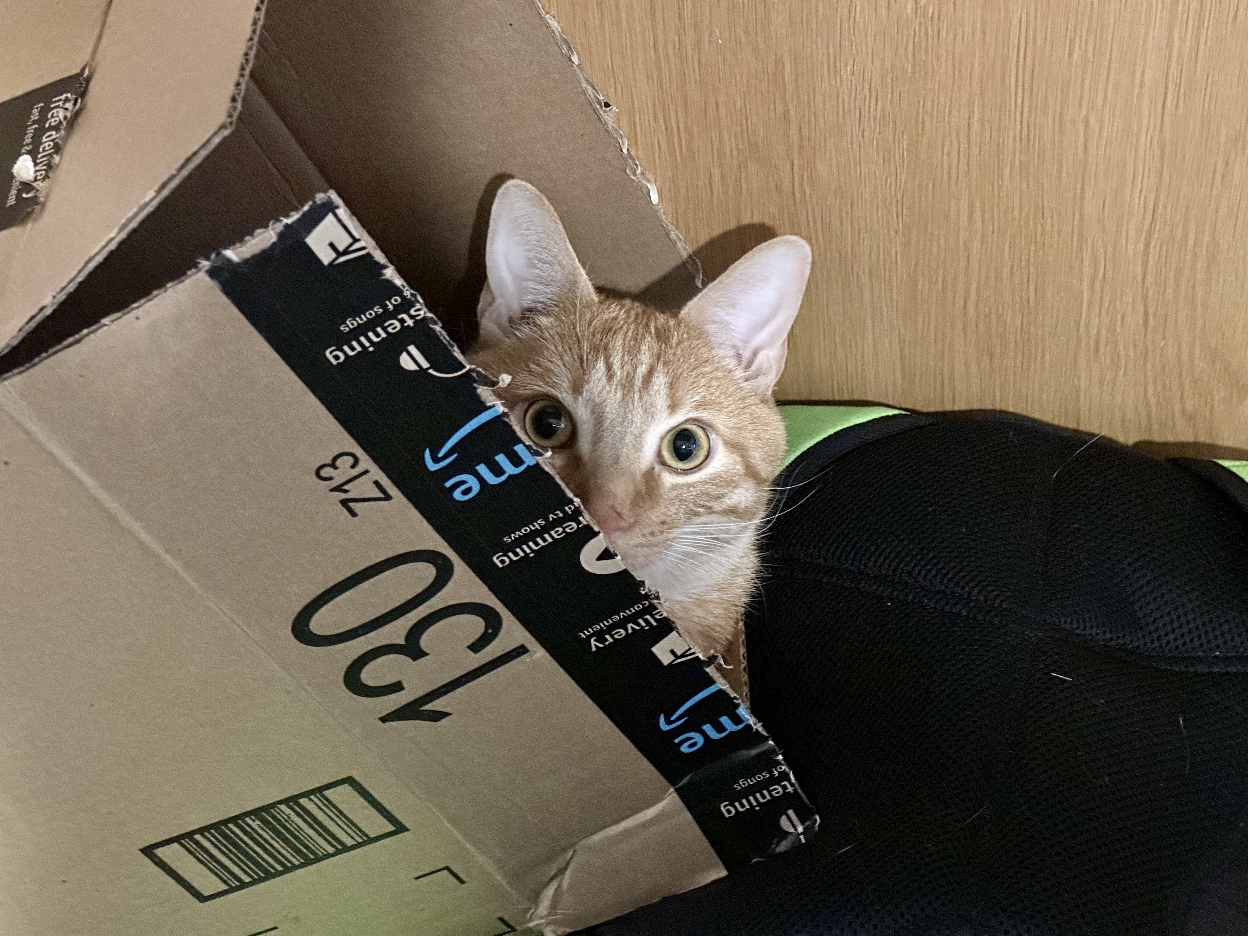
Tried testing the new image uploader with a cat photo on this reply. It says “uploading images” but nothing uploads.
14 Pro Max with iOS 16.6 btw.
Huh that’s weird. I wonder if that specific image is causing issues? Are you able to try another?
It worked from my lemmy.world account. Lemm.ee must not support images.
I should put a check in for that then. Cheers for the heads up!
The error it gives me when I use the mobile site is that my images are too large. I’m betting that it’s either a generic error because they don’t actually support images, or they have the limit set so low that it’s effectively disabled.
Maybe the best thing is to pass on any error messages the server gives the user trying to upload?
The overlay is a bit confusing at the bottom of a thread and it’s hard to reach the upvote on the left. [edit] bean is still my go to Lemmy client btw. Can’t wait for the upcoming releases. You’re a blast, Steve. Thanks a lot.

Thank you, I’m glad you’re enjoying Bean! It looks like this is a positioning but in themes with translucent tab and nav bars. I’ll look to fix it tomorrow but in the meantime if you use the Dusk theme it should solve it.
I’ve just pushed a build that will hopefully stop any slow down or crashes when scrolling. It still needs some optimisation but please let me know if you encounter any issues.
I love the toebean icons in this new build. You have one for each of my cats! So far so good with the scrolling too.
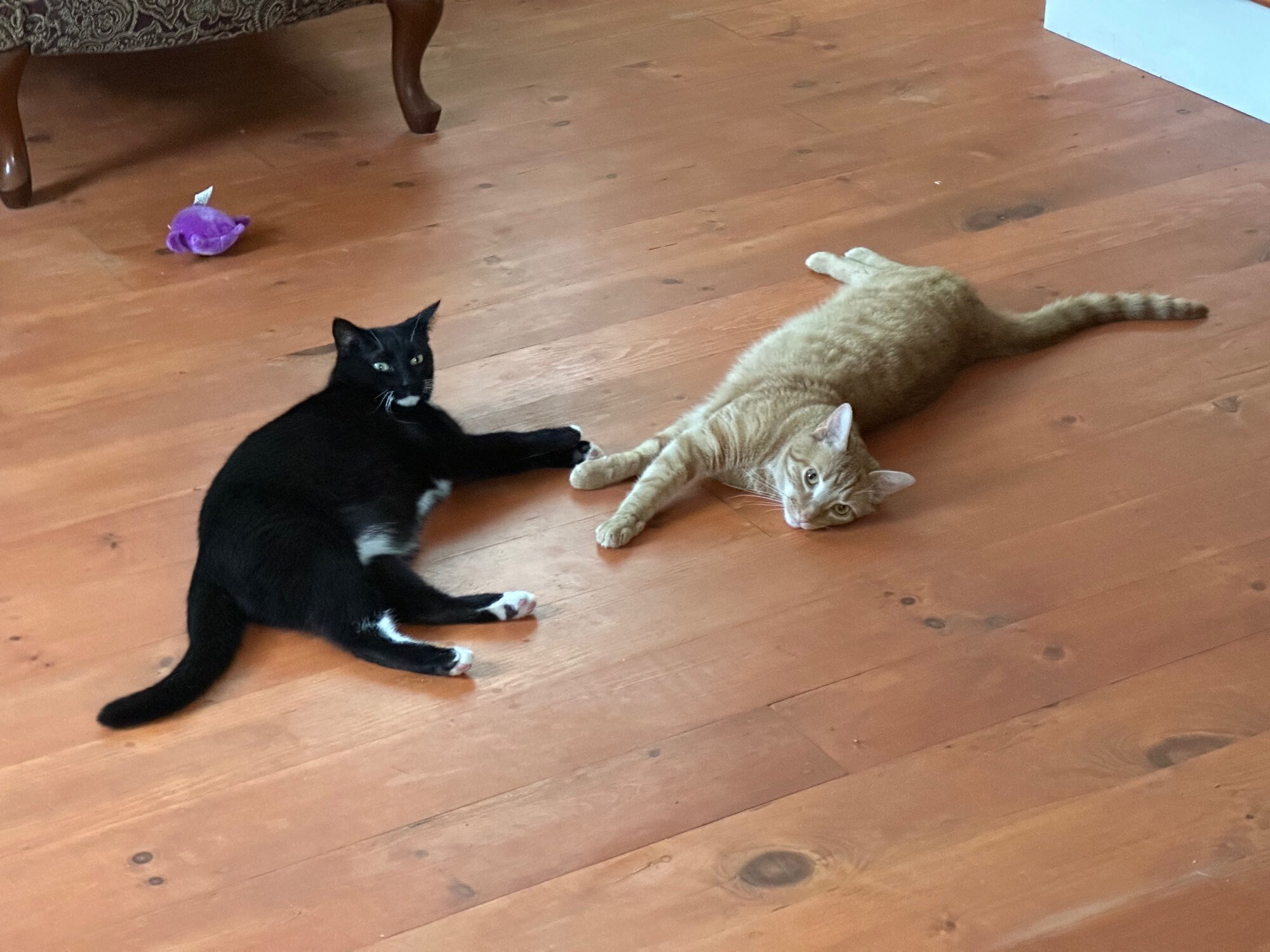
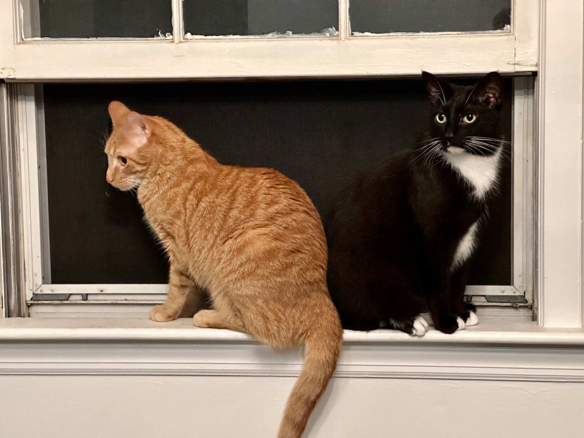
I need to see photos of the cats!
Also, please check out my very talented friend, Noah’s Instagram who I commissioned to design that set.
Digging the new icons as well. I’ll check out the artist’s insta!
Ask and ye shall receive!

One more because the orange cat doesn’t look very orange in the first…

Aw, very cute!! They like grown up versions of my parents’ cats Harry and Daisy😄
Thanks. They are barely grown up. Xander (orange) is 1 and Xedo (tuxedo) is 1.5.
Literally the only thing keeping me from going with this app instead of Memmy, is being able to sort by top 3, 6 and 12 hours. It’s so smooth.
I’ll add that in tomorrow 😊
Dunno what magic you’re using but this app feels really good.
Keep up the great work, this is a great start to potentially being the best Lemmy app.
Ahh thank you! That means a lot 😄
Issues with opening communities within the community tab. No action happens when clicking on a community


