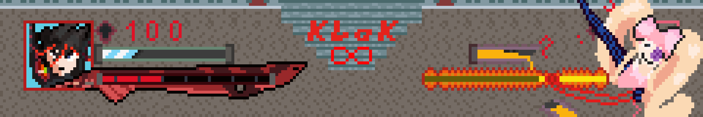
it was a lot more difficult than i thought it was gonna be, designing and all, im glad i got nuis 4thwall breaks in there
You must log in or register to comment.
Ryuko’s portrait looks pretty good, but that red text is really painful on the eyes.
yeah understandable, i should have gone with a softer red instead of the bright klk font red