
You must log in or register to comment.
WHERE IS THE FUCKING LINK TO IT???
I really really wanted this to be real. Most foss logos are pretty lame imo, and so is this one but it’s just too damn funny.
If you scream you die.
One does not talk about the sandwich
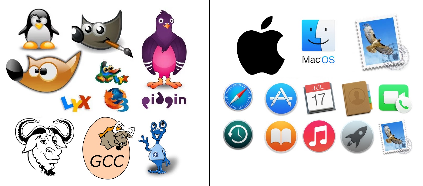
Everything on the left (except Tux) is terrible today and that’s fine, things evolve. It would be fun to see modern versions of each of those logos though.
I was so in love with Pidgin for a while that I even made a mock-up for how to improve it. I think I still have blog posts up about it.
Firefox 3 was published in 2008. This post is 16 years old.
Including Tux, they look like they’re from the 90s (probably because they are). I’m glad we don’t see much of the branding mascots anymore, even Tux isn’t really heard of now.
All the mascots retired into SuperTuxKart.
Gnu, Firefox, and gcc are not terrible
How dare you to hate on Wilber and Gnu. Thoose look better than tux imo
I still use pidgin and finch… They’re admittedly wonky but the only way I’ve figured out how to get a lightweight client for m$ teams (need for work…)
I think they just meant the logos are terrible, rather than the software
I used pidgin all the time about 10 years ago for MSN. Has it changed?
I love pidgin, I’d still use it if they’d support OMEMO, OTR being outdated and all.
Soul is when cartoon animal
I wonder what is OPs take on Darwin mascot.
Probably that it’s perfect and full of soul
But it’s not really an animal.
Edit: just noticed fedora’s whateverthefuckthisthingis and it’s on the left.
I think it gets a pass. The only way for software to have soul is if its icon doesn’t indicate what the software does in any way.
Ill take soulless thanks. Those terrible icons need to stay in 2004.
As a graphic designer, I would argue Apple’s designs are woefully behind on the times.
Yes, minimalist design isn’t necessarily soulless.
Right side are all icons for the default apps that come with the OS, the left side are all apps that are independent from one another. A fairer comparison would be to use the icons for default apps for Mint for example, and…
“Freelance artist for hire. Furry commissions and FOSS project logs a specialty.”
Some GNU projects have amazing official logos:
https://www.gnu.org/graphics/package-logos.html
I like pascal especially.Rcutils is literally two turtles fucking lmao
I like Nano’s
I like the wonky icons on the left a lot. GNU is so unreasonably ugly, I can’t not love it.


I think both of these are fine. Certainly way better than most App icons on Android.
Actually, I kinda like definition of fossy things being soul(ful?) vs soulless megacorp software. Even tho people are being both, the latter seem … at least selfish, lych-like perhaps.
The left are handmade and the right, a employee got promoted for getting some Getty Images licensed.
… what?
Finder, Safari and Mail icons are iconic symbols created a loong time ago and thankfully apple didn’t butcher them completely when they got modernized. The rest are generic, but very much in a specific Apple style of icon born with the OS X.
Still soulless af.
If you found a person who had never seen any of these. they could accurately guess what most of the icons on the right are for. And they could probably only guess gimp from the left.
Also, the apple side are app icons, while the FOSS side are a mix of icons/logos/mascots.
Icons don’t need “personality” as much as they need to be descriptive and useful. And for Apple default apps, they don’t need to be branded with a flashy mascot, because they aren’t trying to win your brand loyalty, you already are using macOS, so they already won.
I really disagree with your first sentence. A few of the icons are obvious, but most are extremely vague. I actually use a Mac every day at work and I can’t tell you what half of these icons are for (I guess I don’t use them). For example the rocket icon, the book (is it a reader or a dictionary or what?), Safari’s icon looks like a map app since it’s a compass.
I don’t know what the history/clock icon is for and the app store icon is just terrible, and has even fewer context clues in languages where the word “app” doesn’t start with a Latin A character.
Icons rely on all kinds of assumptions and cultural cues. They might as well be hieroglyphics to people who aren’t familiar with them, which is why they need to come with labels or tooltips.
safari, and the app store aren’t great.
I dont have a mac or an iphone, but actually follow tech, so Im at least aware of what apps exist… if I had to guess the rest:
calendar, contact book, video call, time machine backups (this one probably requires knowing that backups are a thing), some sort of e-reader, music app, launcher (macOS did the thing where they added an iOS type launcher when they started making “fullscreen” its own special thing right?), and given the final one is a stamp so… apple mail?
So unless I’m wrong, and we say safari, app store, time machine, and the launcher aren’t clear. that’s still 6/10 icons that ARE clear. Even if we take out the reader… 5/10… it’s still mostly recognizable
Compared to the FOSS side, which gets GIMP. 1/10.
and I agree there assumptions being made. Things like “App store” needs an A because English is not very inclusive, but I dont think that makes things soulless. If their assumptions were “we’re making luxury items for affluent Americans (who generally speak English)” then they made a fine decision for reaching their target audience. I’d argue that the app store icon has the most “creativity” put into it.
Yeah thats what soulless is in this case. The monopoly and locking users into only buying things with a bitten off apple.
Apple probably googled for some just cartoon style and used the first thing.
I’d argue it’s literally the opposite of what you’re saying. They are trying to make the product easier to use by making it explicit what the icon is for. If that makes you happy, that’s not locking you in.
They do plenty of locking in. This is not that.
I’d much rather tell grandma “the music player is the music notes” … she’ll remember that. and not “the music player is the one with the lightning bolt” because she won’t remember that.
Even if you don’t like him. I highly doubt Jony Ive designs things by just googling cartoons. Lots of thought went into these icons. I feel like these are from multiple eras of macOS… Theres the “consistent” ones (the circles) and the “skeumorphic” ones (the stamp, the contact book, calendar)
As far as ICONs go, I vastly prefer the ones on the right. As far as brand mascots go, I prefer the ones on the left.
We’re not even comparing apples and oranges here. Neither side is soulless, theyre just achieving different objectives and you seem to have a bone to pick with apple.


