- cross-posted to:
- [email protected]
- cross-posted to:
- [email protected]
Via /u/MishaalRahman
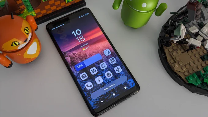
Smart Launcher 6.3 will make Material You Themed Icons compatible with ANY version of Android. In the picture an “ancient” Pixel 2XL running Android 11. #Android #Material #homescreen

I enjoy Material You design overall, the themed icons though are not my flavor, I would much prefer icons following a strict guideline like on IOS and still remain very differentiated.
Could you explain how the guidelines are stricter on iOS? I’m not familiar with Apple guidelines.
Btw, just to give a bit of context for the Dynamic Icons: In Android, the notification icons need to be monochrome. Samsung is the odd one out and allows colors.
As such, devs are already sort of expected to develop a monochrome variation of the App Icon to be used as the notification icon. using the same design for the Dynamic Icon shouldn’t really ask more from developers. Issue is that some devs don’t even do the bare minimum, some apps just use a filled circle as a notification icon cause they forgot to check it.
Plus, there was a whole category of monochrome Icon Packs in the Play Store. I personally used Whicons for instance. So, making it official also helps with that.
The notification icons are definitely better than the colored ones. I probably exaggerated a bit about the “guideline”. What I really meant is that on iOS all icons have to be exactly the same size and shape, and they all look crisp, on Android it’s not guaranteed.
…it’s been years since Android implemented the idea of Adaptive Icons. Which was made precisely so that icons have the same size and shape. Even if the Dev didn’t update the icons in the last 5 years, the background would default to white.
Nice.


