This update aims to add comprehensive filtering rules, allowing users to filter by almost any criteria.
This is the last core feature that will be implemented before the v1 release.
Changes so far:
- Add filter by keyword, community name, instance name or OP’s name
- Support filtering using regex rules or regular string matching
- Filter posts by their primary content type (NSFW, link, image, video, etc)
- Add
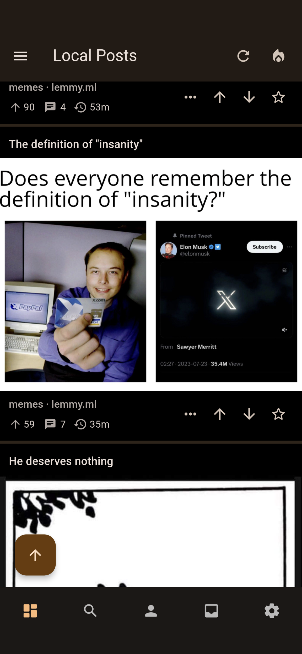
Card2layout. This card layout puts the image in the middle of the card instead of at the top or bottom - Change relative time to be shorter.
- Add setting to use title styles for post items
- Switch to material you text fields in some places
- Fixed a bug where dividers between comments would sometimes disappear
- Add setting to change global font size
- Change swipe to vote to toggle the vote
- Fixed a bug where certain links would not render properly
- Fixed a bug where tapping on multiple posts at the same time can cause weird behavior.
Update
I am going to be making a release tonight unless something goes horribly wrong. I still have like 5 more user requests to work through. If I end up not having time to implement it tonight then your request will be in the next update.
Update2
Tested the app for an hour. The app seems stable enough for a release but I have to head to bed. I’m going to do a partial release and finish up in the morning.
Update3
I keep finding more bugs. We are on v0.1.56 now. I think we are finally good for a release. :hopium:
Update4
I lied. Found more bugs. v0.1.57 now.
Android Themed icon doesn’t work.
Could you either provide a screenshot or give more details?
 in the notes of an update said that support for Themed icons were added but it never changed.
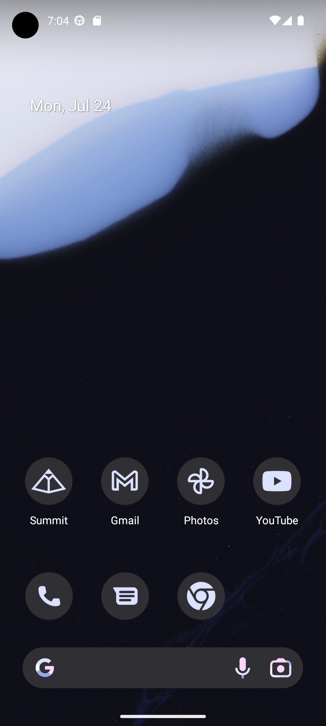
That is really weird. It works on my test device:

Maybe you need to reinstall it?
I can’t change the shape
Ohhhh I think I figured it out. Apparently there are two places I need to set it. I only set the icon for round icons. If you change the icons to round do you see it then?
In any case I’ll fix this for the next update. Thanks for letting me know!
I attempted a fix for this in the latest update. Can you please confirm if the issue is fixed now?
Yes it’s fixed.
Awesome. Thanks for confirming!
Would it be possible to have something like a card 3 option where the title is above the image, but everything else is under it?
I also found a bug. If you use card 2 any of the image settings crash the app when toggled on or off.
Thank you for reporting the bug. I’ll make sure to fix it before the final release.
As for card 3, this is easy to do but I’m have a hard time picturing it without it looking really weird. Do you know of any apps that offer such a layout or have any examples?
Here’s an example from the thunder Lemmy app.

That looks kind of weird to me but I can implement it for the next update.
It might look better with square cards? Idk if that’s something you’re thinking about implementing at some point as an option.


