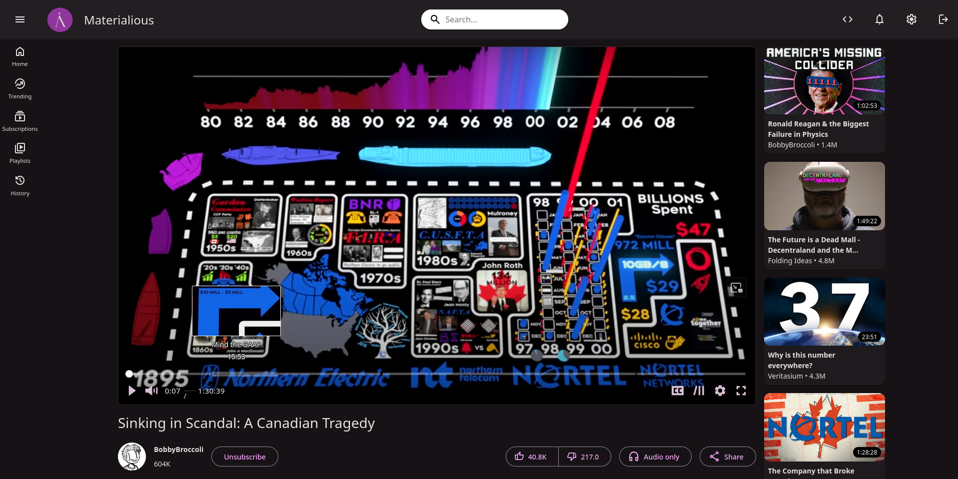
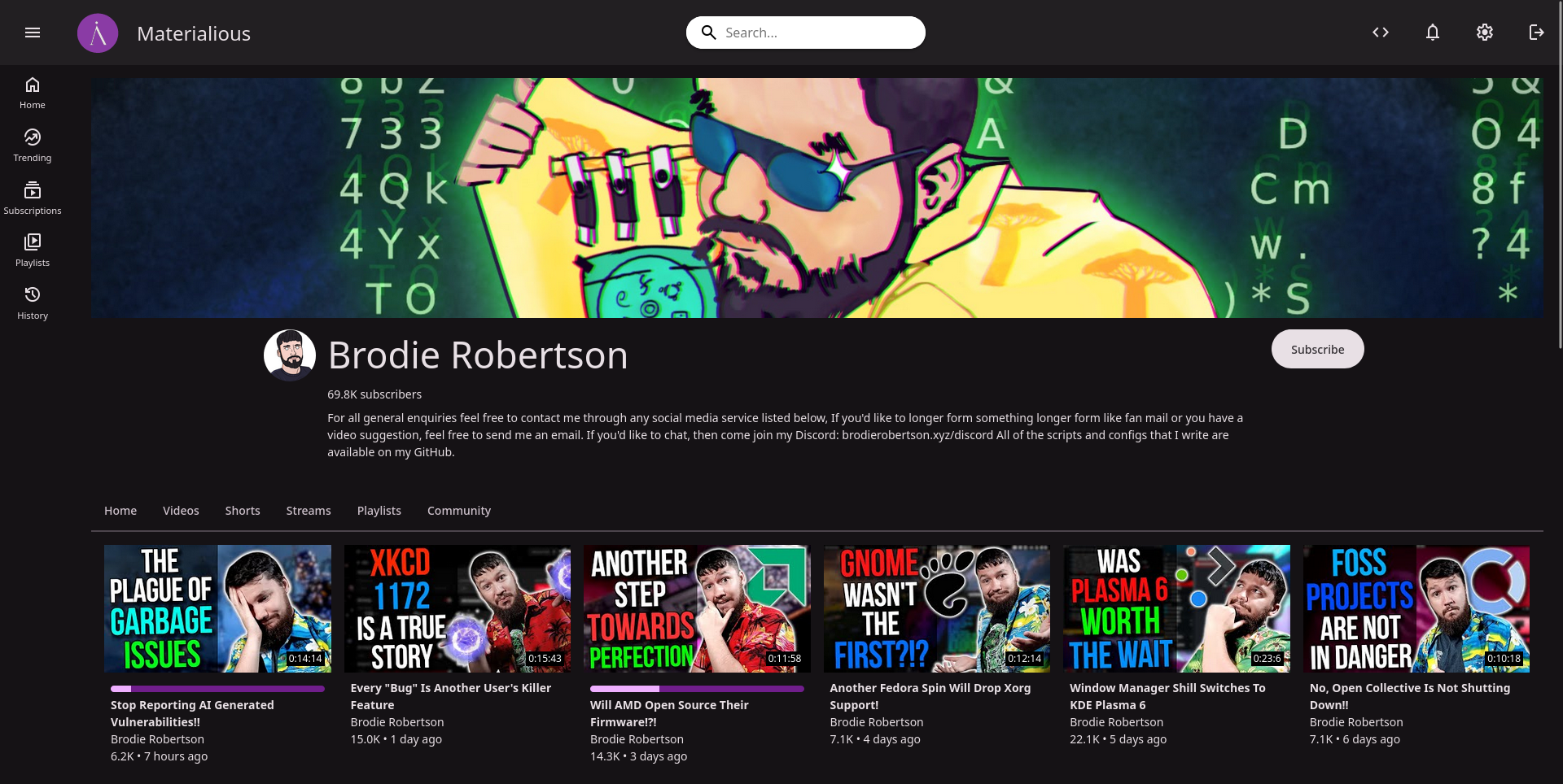
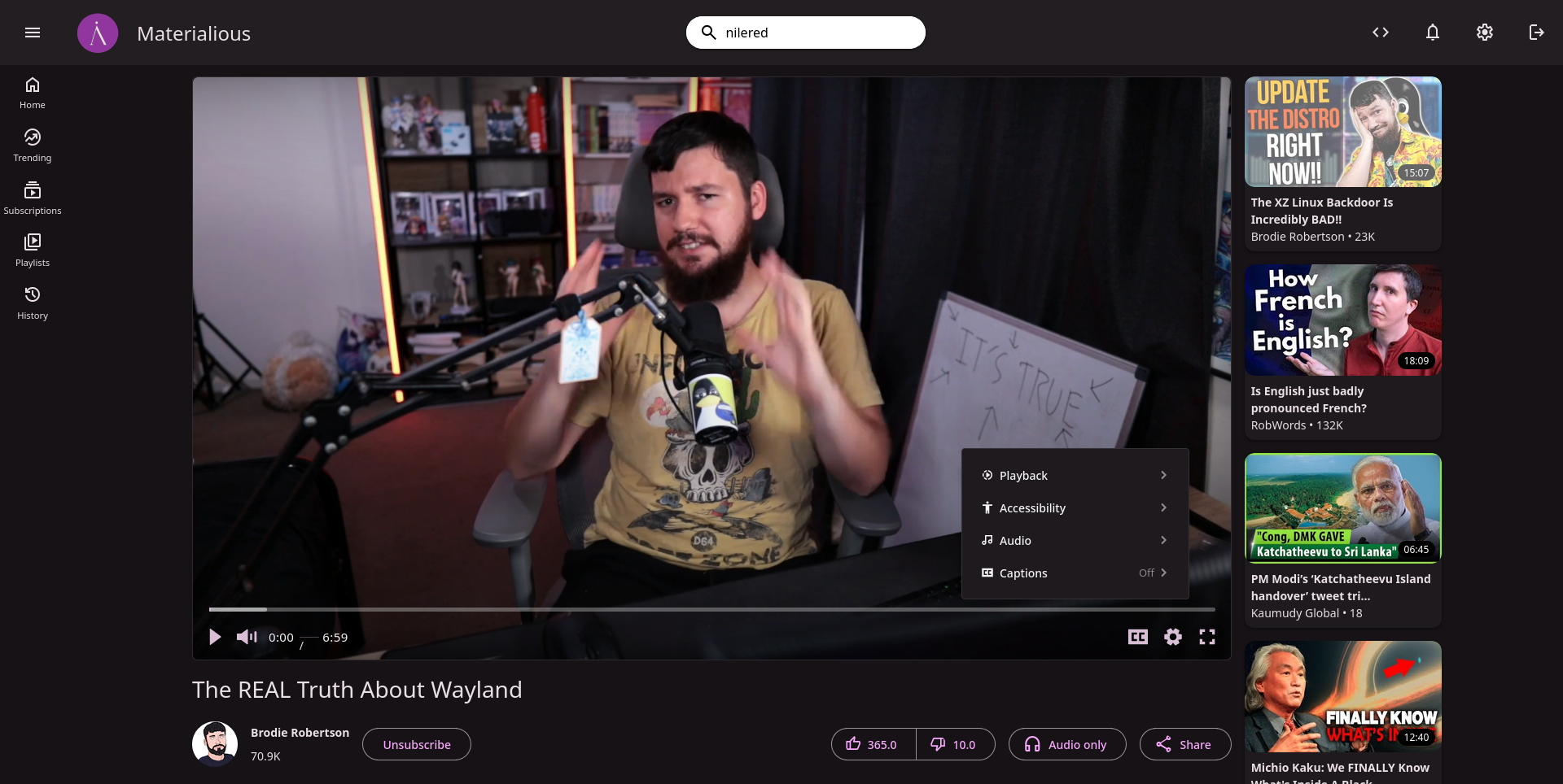
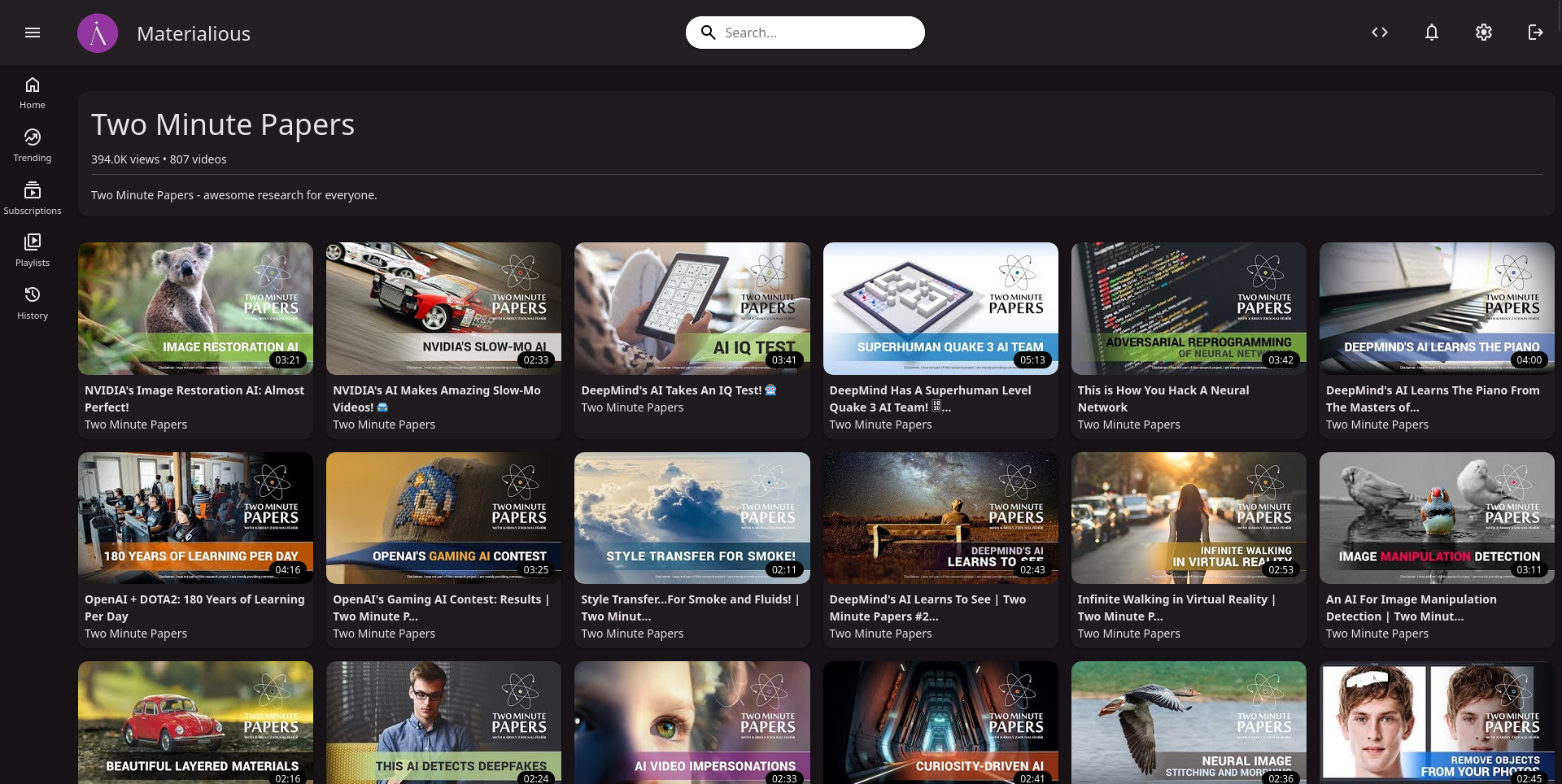
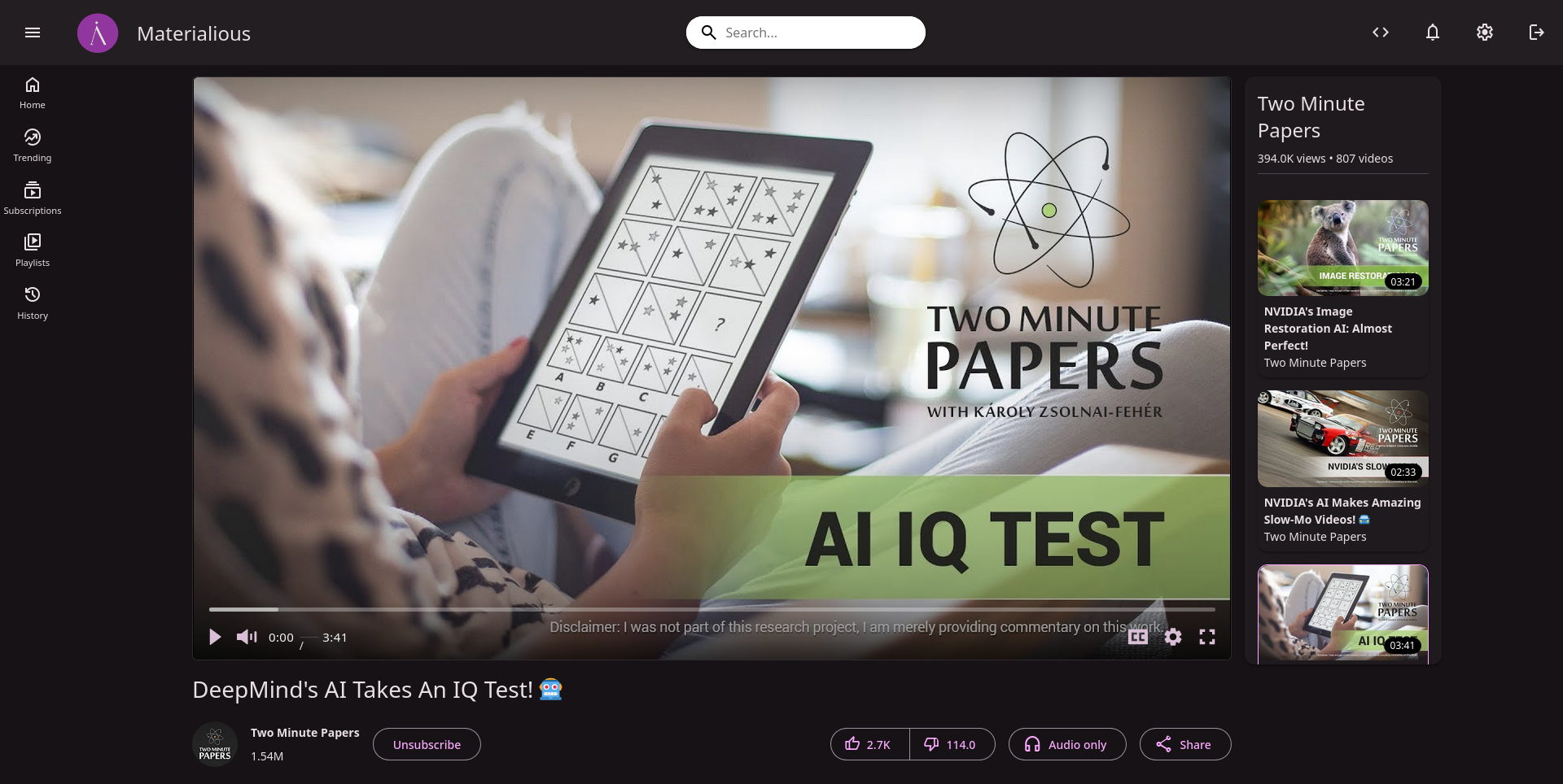
For the last month I’ve been working on a modern, material you interface for Invidious.
Github (Leave a star if you want)
Features
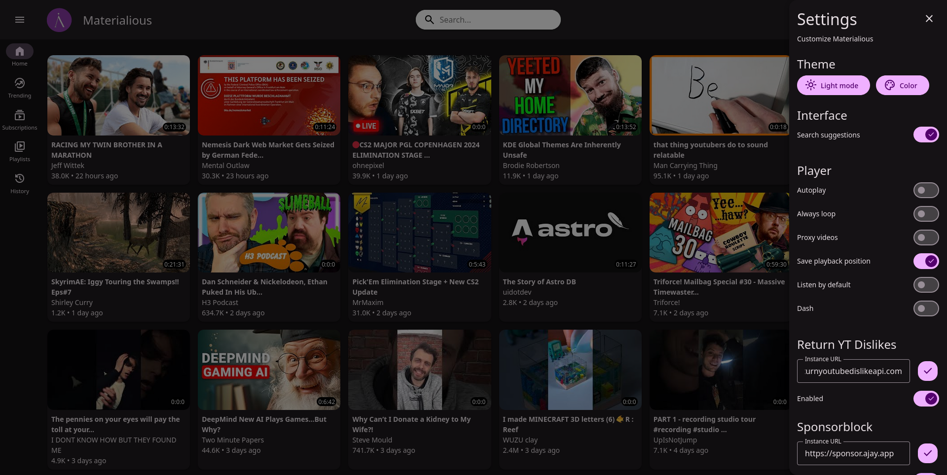
- Sponsorblock built-in.
- Return YouTube dislikes built-in.
- Video progress tracking & resuming.
- No ads.
- No tracking.
- Light/Dark themes.
- Custom colour themes.
- Integrates with Invidious subscriptions, watch history & more.
- Live stream support.
- Dash support.
- Chapters.
- Audio only mode.
- Playlists.
- PWA support.
Material Design is still modern? I thought Google had revised that again.
(Using only Apple devices, I wonder if I should make an Apple-like interface now…)
Material design 3 was released in 2021, so I’d call that somewhat modern and is the latest release of Material design. Unlike Apple’s design language Material design is also meant for the web.
There is already a Invidious interface for Apple devices, but ofc isn’t a web interface like Materialious.
Ah, thank you. It’s been a while since I had to work with Android.
lgtm 👍
Let’s go to mars?
Am I hip now?
From the screenshots only: is the dislike and like count being floats intentional?
Because it’s always formatted with a decimal even if it’s 0?
This looks sick
Well freaking done, looks amazing!
So it’s basically a YouTube app that uses invidious as the backend?
yup


