
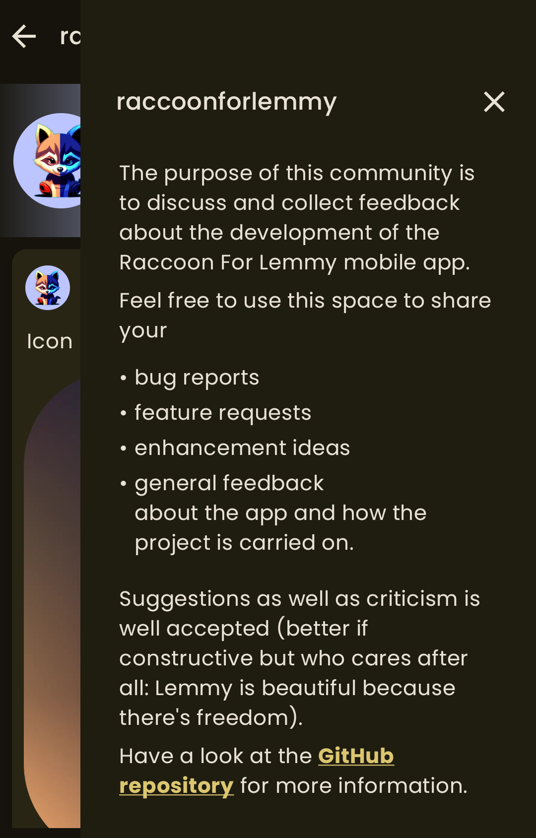
I’m passionate about creating icons for open source projects, and I noticed that the current icon leans more towards being an illustration rather than an icon. So, I decided to give it a try using Inkscape - what do you think?
Wow! That is amazing! 🤩 If you guys like it and the author gives me permission to do so (I’ll add some credits section in the app too) it can be integrated, of course.
I can send you the svg file
Can you send me svg too?
Tou can find everything here.
I don’t know what raccoon is, but if it’s even remotely as good looking as this icon, I want to use it.
I do like the current icon, but I have to say, what you have created looks awesome…👍🏻
Slick use of negative space!
That’s gorgeous!
A little late at night, but I think I finally managed to do it, see here. The new icon will be the default choice but the old one is still available for users who want the “classic” style.
The splash screen and notification icon have been changed as well. And, naturally, I’ve updated also the image & banner here on Lemmy too.
Looks great!
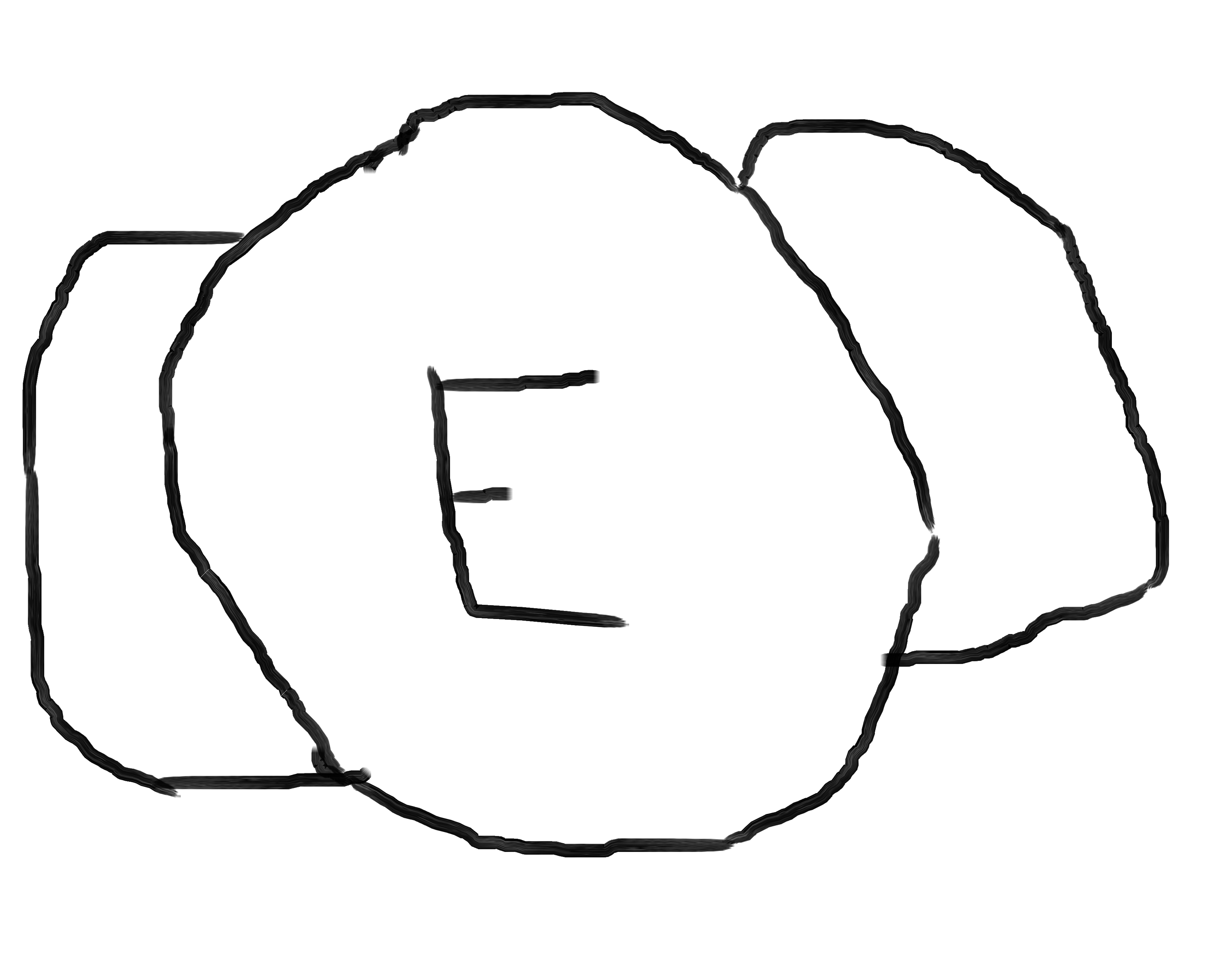
Looks great! What if you simplified it even more? (apologies for the hack job, I did this on my phone)

Agree to disagree, I really liked the raccoon’s ears tbh.
Sure, just playing with it
I like the idea to nix the eyelashes; it seems more like the beady eyes of a raccoon that way. I really enjoy the ears though, and it wouldn’t really seem like a raccoon without them.


