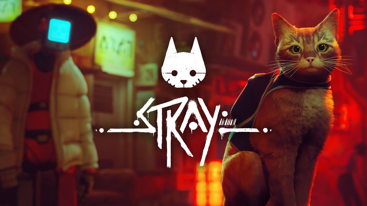
Looks super rough imo. How do all of these ports look like they’re being viewed through Vaseline but games like Mario odyssey are nice and sharp.
Optimisation is hard, especially when it’s an afterthought. SMO was built from the ground up for the switch. Just like zelda. The switch is not a powerful console.
Funny, the top comment is saying how good it looks and the second to top comment is saying how bad it looks
Wow, it never ceases to amaze me how some games can look so good on the switch…
Unless that’s just PS5 footage?
That’s definitely not ps5 footage lol, but yeah it looks solid!
Oh ok, I watched it on phone so wasn’t sure.
a good art game, the switch users will marvel at its amazing and advanced ‘no cat butt’ technology.
Hmmmm yeah I’m torn on this one. Id put stray into a category where visuals are actually important and I much prefer to play it at 4k than on my Steam Deck. Normally Im 100% gameplay over everything.
But it doesn’t look awful they did a great job working with switch hardware.
Overall I’m happy more people get to play Stray, its the first game my non gaming girlfriend saw videos of and wanted me to buy it for her. And like a lot of people, she probably wouldn’t even notice if it was running at 1440 vs 720.
Orange kitty go purrrr


