
The food inflation crisis in the developing world has been front-page news. But spiraling food prices are much of a developed world problem, too.
The highest inflation in 50 years has forced them to change their shopping and eating habits—including cutting back on how much they tuck away at meals.
Call it “dietflation”.
deleted by creator
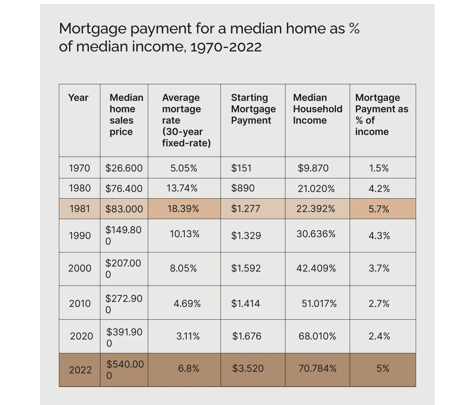
Yeah, right? OP needs to change the formatting on the second last column and the last column looks like a monthly payment expressed as a % of annual income?
Quickly did the math on two sets, the second to last column has the correct numbers but like you say is written as percentage instead of dollar amount. Weird mistake to make.
Last column makes sense when you have dollar amounts in the column before. Percentage of income payed for mortgage.
Edit: Scrolled down more and say another post by the same poster. This image was meant for that post.
Side note edit: Periods were used instead of commas for the numbers, could be partial explanation of being able to accidentally make it represent as percentage.
Showing the monthly payment as a percent of annual income is also very confusing.
deleted by creator
They are trying to push a certain narrative so I’m sure their next post is going to be about food prices.
I wish my mortgage was 5% of my income 😂
If you are spending more than 5% of your income on a mortgage every month (60% of your income annually), you bought a house in too expensive of a neighborhood. Look outside of metro areas, shit gets much cheaper.
How are people only spending 5% on mortgage in a month?? I’m at 25%
The chart is talking about 5% of annual income per month on a mortgage, ie, 60% of annual income on a mortgage over the whole year. Which means you are spending under half of the average; which is absolutely where you should be!
The chart uses very funky units.
Nothing says ‘smart financial decision’ like moving three hours from work because all of the cheap houses are literally in the middle of nowhere.
If these figures are accurate and I am reading the chart correctly, housing prices went from about 2.7x annual income to about 6.4x annual income. I feel like artificially low rates have had the effect of inflating house prices along with builders building houses that are too big and with too many features. Very few 3 bed, 1 bath houses without large garages. People who wanted these houses are forced to buy bigger houses because that’s about all that’s available.
Well according to this chart, the percent of your paycheck going to the mortgage is better than it was in '81 and not that much worse than '90.
Also you don’t have to buy a $500k house. You choose to do so.
Also you don’t have to buy a $500k house. You choose to do so.
What if there’s nothing else available? As is the case in pretty much every metro area… everywhere.
There’s always something available but people aren’t willing to commute. Or move.
I’m not too keen on moving out two hours from where I work, no.
The only thing that’s worth more than your money is your time.


