The Nissan Cube annoyed me enough at it was.
At least the Nissan Cube was unique. I’m slightly more than mildly infuriated that “shrunken SUV” seems to be the new standard vehicle shape. Hate this “crossover” trend. lol
Spacious and luxurious without being a huge tank on the road. What’s not to like?
If that’s your thing, you do you. I’m not against them existing, I just think they’re ugly and excess and wouldn’t want to drive one, personally. Half or more of the crossover styles, IMO, look like rollerskates, lol, and I just can’t take them seriously (once you see it, you can’t unsee it).
I agree with the you do you thing but the manufacturers no longer seem interested in making other kinds of cars these days
I just don’t know why anyone cares, you can’t see the thing when you’re using it anyway.
This is why I don’t care that I’m so ugly because I can’t see my own face.
Exactly! Let the rest of the world deal with it, it functions properly for me.
Yeah, pretty much anything is better than SUV as commuter vehicle. It only became a thing in the first place because of poorly-crafted environmental regulation.
Spacious? That is not true for most SUVs or crossovers when compared to their non-suv variant. (Looking especially at you, Mercedes!)
Luxurious? The non-suv variants are just as luxurious, no difference there.
I don’t know, maybe the fact that it was a fucking cube?
“Shrunken SUV” or “Took a normal 2- or 4-door and injected it with experimental growth hormones.”
I swear I see one once a week that would make sense and carry the same number of people and stuff at half the overall vehicle volume.
It’s a car-shaped car, idk what the problem is. Were you expecting tentacles?
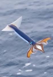
I was expecting something that looks at least vaguely like a nautilus.
I mean… Don’t you think this is a bit of a far fetch? A car couldn’t look like this it would be ridiculous!
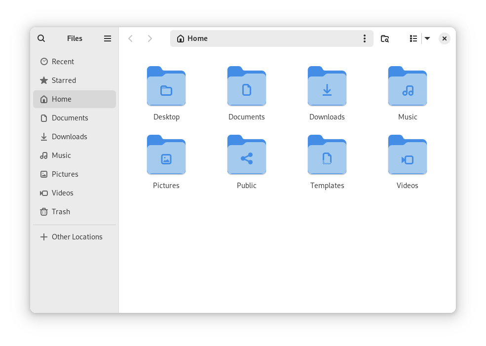
Today I realized lots of Linux file managers are based on sea things
-
gnome, nautilus
-
KDE, dolphin
-
cinnamon, nemo
xfce, thunar
PCManFM… wait no
-
You’re a sassy little gnome.
Like with stripes or a big round shell that it protrudes from? Don’t get me wrong, it’s a cool-looking animal, but it would look dumb as hell if someone tried to make a car actually look like one imo. Maybe a spaceship or a deep-sea submersible, but not a car.
I used to be able to differentiate car brands in the blink of an eye, each brand had pretty distinct features. Nowadays it’s a pretty boring blend, apart from a few luxury brands perhaps.
Well… the Cybertruck has unique physical features. They’re not features I’d want in a vehicle, but…
Anyway, I was looking here and yeah. Very boring. https://www.caranddriver.com/features/a46550349/2024-editors-choice/
I saw a cybertruck in person the other day, pictures cannot fully convey how fucking hideous they are
Stainless steel, sharp edges, it’ll take your finger off with ease if you’re not careful. All traits I look for in a good kitchen knife.
You can still do that nowadays, if you give a fuck. I don’t.
Hyundai/kia are doing really well recently compared to everyone else, their designs are really recognizable and stand out a lot. Some of them aren’t the best but it’s better than everything looking identical
True.
You just don’t know cars that well then
Dumb question… What’s the issue? I’m a Venza loving freak so I could be biased.
It doesn’t look at all like a Nautilus.
Is it supposed to? I mean, a Jaguar doesn’t look like a jaguar either 🤔 But if they market it as being designed around a nautilus’ shape, then yeah it sucks haha
You know what? Sue them ALL for false advertising!!! I bet this thing can’t even travel underwater.
Eh. Just looks like any other oversized SUV to me. I miss when cars had distinct designs…
If Audi’s headlights and if BMW’s front grill’s tumor continued growing had a baby (?)
Spot on 😆
looks to me just your average suv car
Is it the hubcaps? It’s the hubcaps isn’t it.
cephalopod
…a wut?
Looks like a wankpanzer to me.
Nice oversized hatchback with no internal space
another mildly infuriating thing: the diagonal bar on the capital n looks thicker than the other lines! well, at least it isn’t barely visible (used to be really thin with full hinting on ubuntu)
