- cross-posted to:
- [email protected]
- politics
- cross-posted to:
- [email protected]
- politics
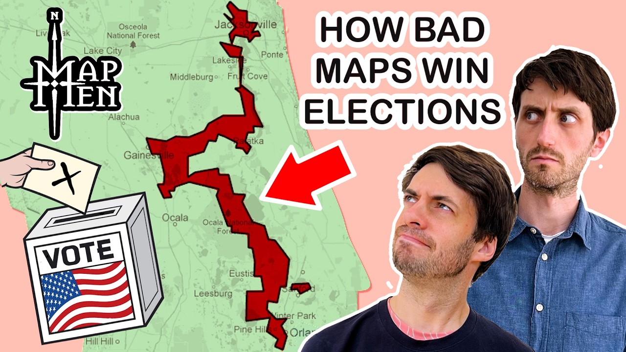
Map map map men men
If you’d like to be horrified, Alpha Phoenix shows how to make election maps that don’t look like they’ve been gerrymandered, and might be hard to spot what is wrong with them!
I was going to post that video. First past the post is broken. Technology has far outpaced the idea when a YouTuber can draw harmless looking maps to not only decide elections but also decide how sensitive the election is to voters changing their minds on specific issues.
I love map men!!!
their regional offshoot hommes cartes aren’t bad either
hommes hommes hommes carte carte
Map men! Map men! Map Map Map! Men men men
well done - as usual
My only real complaint is that “have an ai do it” isn’t a great suggestion though; an ai wil have the same bias as whoever developed it.
Given the other suggestions next to it, I don’t think they want you to take it seriously.
Fair enough
I always think of this infographic illustrating an easy to understand version of districting/gerrymandering. It’s obviously leaving out the real life complexities and difficulties, but it gets the idea across.
The general solution is proportional representation. E.g., ranked ballots under Single Transferable Voting. Six seats left? First candidate to 1/6th support wins. Count only top votes, eliminate the least popular candidate, repeat. Remove whichever ballots went to that guy. Five seats left? First candidate to 1/5th support wins. Etc.
Also: Democratic.


