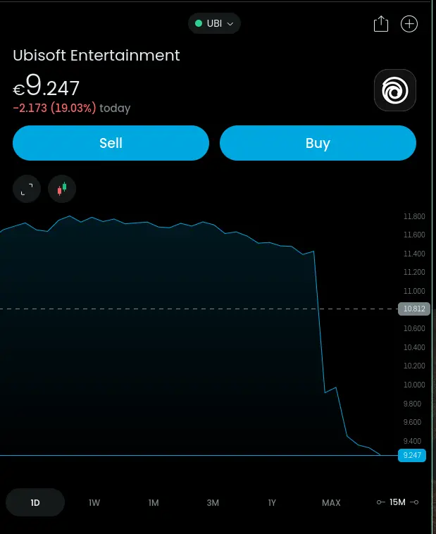
I’d argue it doesn’t accurately show the relative value at a cursory glance. The chart shows the area under the curve having decreased over 90%, but when looking at the y-axis, you can see that initial assessment was misled.
In a speculative industry like finance, shouldn’t we try our best to make charts less… alarmist?