
It’s pretty easy to spot dark patterns when you look out for them, but I found a pretty obvious example of this.
Stoofie is a brand that sells water fountains for your pet (I don’t know what the problem with a water bowl is, but I digress). WayBack Machine
Plastered at the top of their website is “33% OFF Ends Today- Free Shipping” with no way to dismiss it. There is a scrolling text under the main image “FAST AND FREE SHIPPING 60-DAY FREE RETURNS”
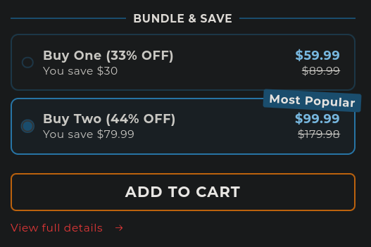
If you scroll down, you’re immediately introduced with a product with the option to buy two preselected. The rest of this section explains itself:
Other things are sprinkled in the main page, but it really is the prime example of dark patterns. I am personally sick of finding them, but would love to see more examples of what others have found. Please, share your favorite examples of dark patterns. Don’t forget to archive them first so they can never be lived down.
Oh they care. They care a lot. Particularly that you don’t have any so they can sell all your details to any bidder.
They care about it so much that they probably have a full time UI designer whose job is to figure out new ways to trick and manipulate users to hand out even more data.