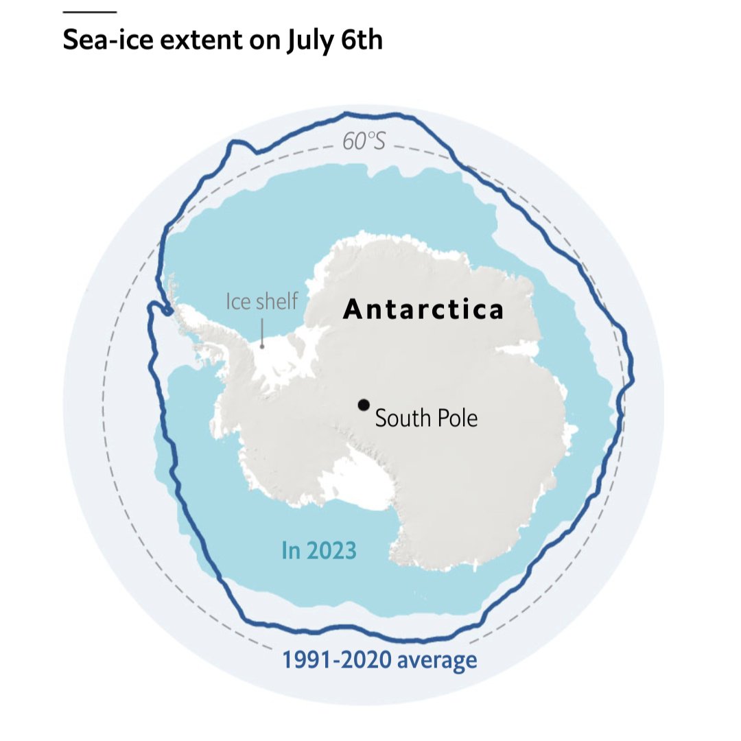
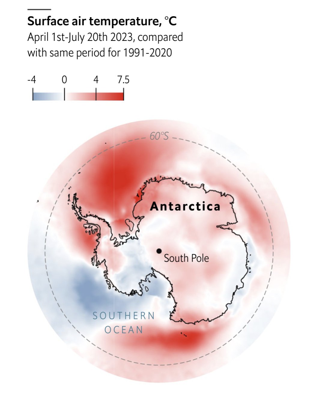
That 2023 line does not look ideal…
Source: The Economist
Each point represents a five day moving average. The x-axis is in terms of historical standard deviations, i.e each day is compared to the standard deviation of historical values for that year. So we are at -6 SD from the historical average for this point in time.
Other excellent visualizations are in the article!


Take that, stupid mean sea ice. That’s what you get for sinking our boat. Apes together strong.