Raccoons of the Lemmyverse, we’re back! A new beta version of the app has been released, as promised in the last AMA (it was the next internal milestone).
Let us know what you think about it, you’ll notice that there have been several layout improvements since the last version, e.g. bottom sheets have a new style, clickable areas now show the ripple effect, etc.
Hope you all enjoy it and, as always, L.F.E.T. 🦝🦝🦝
Thank you 👍🏻
Glad to see you still hanging around here 😉 And to see that this project still matters for someone!
We are here. Please continue. Raccoon is the only client I see that makes best use of space. Having releases more often will get the interest back up.
Remains the, go to, as someone already mentioned, makes great use of space, & I find it very clear and unclutrered, plenty of options…good to see things moving forward👍🏼
I found 2 small bugs:
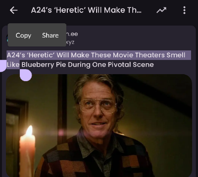
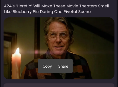
- copy & share stays on top whenever you select some text and stays fixed even after leaving the post
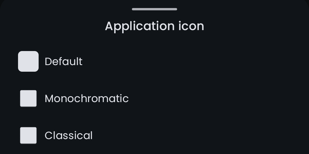
- app icons in settings are missing


