That’s interesting, however it sounds like a flawed study because it’s a small data set that could be influenced by a number of variables.
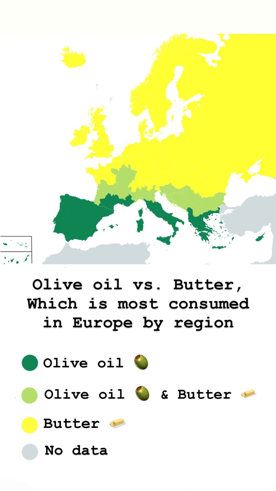
Another way to look at it is by the ‘butter vs olive oil’ map of Europe. Italy and Spain have the highest life expectancy rates in Europe, Romania and Bulgaria have the lowest.
To be clear, I’m not actually saying that this map is proof, just pointing out that it’s easy to find correlation either way.
I checked the link to the study (which I didn’t realize was shared from the Revisionist History site), and I was incorrect about the scale:
Setting
One nursing home and six state mental hospitals in Minnesota, United States.
Participants
Unpublished documents with completed analyses for
the randomized cohort of 9423 women and men aged
20-97; longitudinal data on serum cholesterol for the
2355 participants exposed to the study diets for a year or more; 149 completed autopsy files.
That’s interesting, however it sounds like a flawed study because it’s a small data set that could be influenced by a number of variables.
Another way to look at it is by the ‘butter vs olive oil’ map of Europe. Italy and Spain have the highest life expectancy rates in Europe, Romania and Bulgaria have the lowest.
To be clear, I’m not actually saying that this map is proof, just pointing out that it’s easy to find correlation either way.
I checked the link to the study (which I didn’t realize was shared from the Revisionist History site), and I was incorrect about the scale:
Setting
One nursing home and six state mental hospitals in Minnesota, United States.
Participants
Unpublished documents with completed analyses for the randomized cohort of 9423 women and men aged 20-97; longitudinal data on serum cholesterol for the 2355 participants exposed to the study diets for a year or more; 149 completed autopsy files.
It’s certainly worth a closer look.