Quite like the development of Jerboa as it stands, but I found the icon of the app to be a bit uninspired (and personally I need to have a dark background so stuff doesn’t stand out too much).
Anyway, I got some time on hand last night and prompted DALL-E to create some Jerboa-inspired icons, and after going through dozens and dozens of iterations, prompts and refinements, I was left with 5 that I really like, cleaned them up and tuned them a bit in Photoshop this morning, and here we are:


Now I have no clue what that means in terms of licensing and whatnot. I’m explicitly posting them with no strings attached from my end, but can’t tell if any underlying licenses still apply regardless.
OMG these look awesome 👏👍😊
These are so much better
Thanks! 🙃
I vote 1st and 3rd!
You can just swap them out yourself :-)
(Actually no idea if regular old Android allows to switch app icons. I’ve used the Nova Launcher for almost a decade now, and won’t ever go back).
How can I save those images to device in jerboa? 😅
Honestly I don’t know, that’s the part I do in the browser 😂
Perhaps that’s something for the feature list? 😀 Long press context menu for text/media.
Currently the long press is a toggle on control elements, if I am not mistaken.
Yep, and I have no clue why anyone would even want to toggle those.
I LOVE the first two but they are all so cute! Good stuff
Nice on Nova launcher 😄

Yes, Nova is the best! Glad you like it 😁
You should probably open an issue on GH and just add the icons in SVG or whatever and suggest this to the devs. This way, you’ll most definitely get their attention.
Very good point, I’ll do that in the next few days when I have some time to convert it.
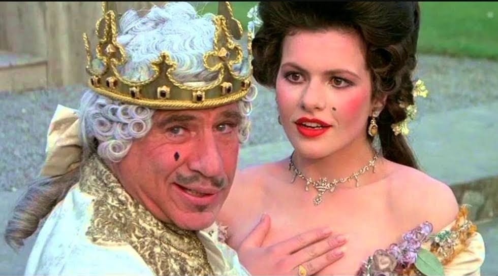
And this is how it looks like in situ (my personal favourite):

They all look great, I personally like the brown one, something different than gray, but they’re all very cute and look very nice
looks amazing!
deleted by creator
I personally like the second to last best, but they’re all really cute looking and just… adorable ☺️.
The 2nd is my personal favourite
Those are great!
We’ll probably need one for a beta version, so keep that in mind when suggesting a specific icon.
https://file.io/Qtm0OkCjgH9W Made a minimalist light/dark theme variant on version 2 since you kindly provided them no stings attached :)


Thank you!! Very nice :)
PS if you want people to use them for anything they like, you’ll want a CC-BY (will require listing you as author) or CC0 license (completely public domain).
Ah nice, thanks a lot! In that case I’m happy to go for CC0, since really most of the work was done by an AI.
My point was just that I don’t know if any underlying license from DALL-E restricts me from opening it up to the public domain. I’ll try to get some clarity.