
Please tho if you have constructive criticism I absolutely crave it, I’m a big boy I can take it
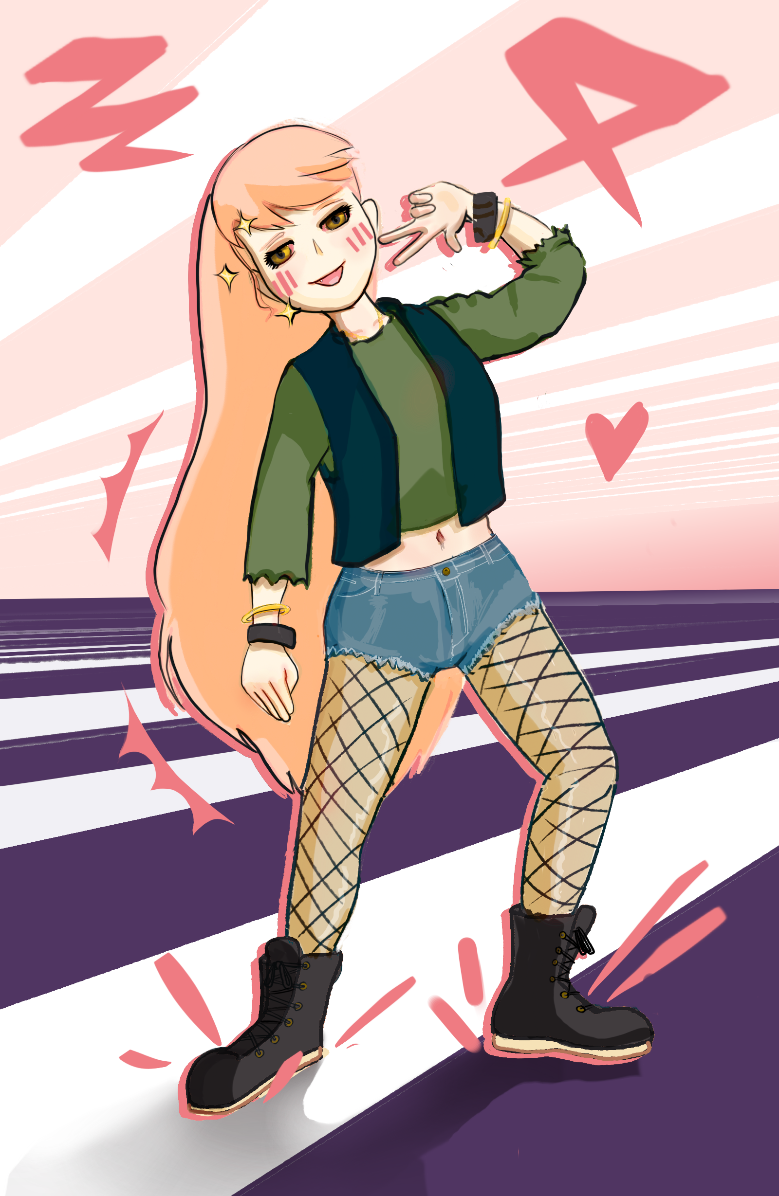
You did a very good job. The real mistakes I can easily identify with proportion are that the lowered arm and the legs are slightly too short, and the foot on the left is a bit too long. The pose looks a little stiff, but an easy fix for that is making the shoulders and the pelvis less parallel. The posing of the hands are kind of stiff as well, but hands are hard, and they look good enough that it’s not really an issue. The bracelets on the lowered hand seem to be curved the wrong way; as it is the viewer is seeing them from the bottom, but in relation to the viewer’s point of view you should be seeing the top. The shorts are basically perfect, 10/10. Lighting and shadow looks flat, like it’s not following the shape of the body and clothes, but that’s something I personally struggle with so I can’t offer much help there. One thing I would change (personal preference) is to push the colors of the lights and shadows more. As it is, the value and saturation changes from light to dark, but there’s not much shifting in hue. Nudging the the light values a bit closer to the color of the light, and nudging the shadow values the opposite way will make the colors pop. Take all this with a huge grain of salt. I am a hobbyist and not a pro.
Thanks super helpful 🙏🏻
Arms too short, head too big. Not very much but you did ask :-)
I see that because it was the hardest hurdle to get over for me, and I still do it if I don’t specifically think about it, I also make the legs too short in the same manner.
I also struggle with proportions, I’ve been practicing with a drawing manaquin.
This looks great to me!
Hi! Looking good. Can I ask if you’re using reference when drawing?
I usually do but not for this one, I actually ran chatgpt through its paces and asked it like 50 times “,how about now?” About my proportions
That may be helpful for now, but I absolutely recommend either starting with a reference or if you want to train and improve your artistic eye, try drawing it, then take a photo of yourself in the same pose. Then you can compare your drawing proportions to your photo’s. Things like that will help a lot more in your ability to grow as an artist and be able to visualize proportions better.
And don’t forget that even professional artists are constantly using reference photos!
