
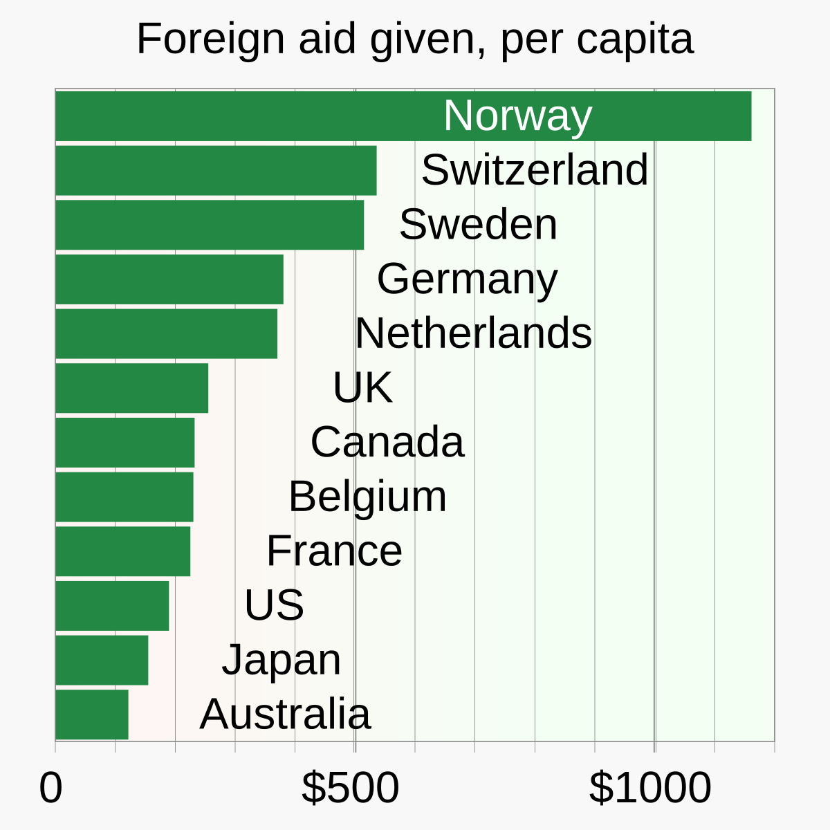
In order is Norway, Switzerland, Sweden, German, Netherlands, UK, Canada, Belgium, France, US, Japan, Australia, with Norway so far ahead they have a different font color.
In order is Norway, Switzerland, Sweden, German, Netherlands, UK, Canada, Belgium, France, US, Japan, Australia, with Norway so far ahead they have a different font color.
But Denmark, Finland, Ireland and Austria are DAC members and they were still omitted. It’s just a bad job by whoever made that graph.
It looks like the graph was added less than a month ago. Image page says the following:
If you want to update it I’d say go for it
Edit: apparently the image was also added to the pages ‘Aid’ and ‘United States foreign aid’ by the same user so… yeah
Still doesn’t explain the omission of Austria (9m) or Saudi Arabia (32m).
I don’t really know how to navigate Wikipedia but the user account seems pretty normal, it was probably just an honest mistake. It seems like they use scripts to make a lot of graphs and maybe some wires got crossed.