I’d say that Microsoft’s Fluent design language is even worse. Material at least tries to use rounded shapes and animations; Fluent has been pretending that monocolored rectangles are interesting since 2010. And it has been consistently wrong.
To this day all five Windows machines in my house are running w10 with OpenShell and all of them use Aero themes. Any machine I set up for someone gets the same treatment. I’ve never had a complaint.
I still think material design 1 (which came out in 2014) is good, which focused on clarity with limited space. The problem started with material design 2 in 2018, which pushed for increased whitespace and homogeny in design. (And Microsoft’s Metro… shudder)
Material design 1 balanced clean and readable while maintaining depth (trying to emulate 3d space by “stacking cards of content” with shadows). But since most of MD1 was guidelines instead of, like, actual components developers could use, it was a double edged sword of forcing people to be a little creative in making their own UIs but cumbersome because you had to make it all yourself
Material design 2 tried to “fix” this by making everything simpler and shipping a ton of premade components that developers could just slap together and call it a day. Good for speeding up development, unfortunate because everything now looks the same. It’s also because of this that material design started to “break containment” and appear all over desktop applications/websites. It’s never good when a mobile design language is applied to the larger desktop space
That’s why I really don’t mind seeing material design 1 on either mobile or desktop, because it was designed to use space efficiently and interestingly. Material design 2 on the other hand favors whitespace and speed to the detriment of us all


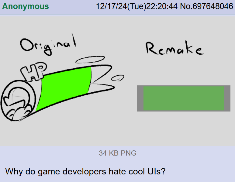
Blame Material UI, the most fucking boring design timeline.
I’d say that Microsoft’s Fluent design language is even worse. Material at least tries to use rounded shapes and animations; Fluent has been pretending that monocolored rectangles are interesting since 2010. And it has been consistently wrong.
They need to bring back aero
Bring back Microsoft Bob
To this day all five Windows machines in my house are running w10 with OpenShell and all of them use Aero themes. Any machine I set up for someone gets the same treatment. I’ve never had a complaint.
Openshell is nice but I want my colors and transparency effects 😭
I still think material design 1 (which came out in 2014) is good, which focused on clarity with limited space. The problem started with material design 2 in 2018, which pushed for increased whitespace and homogeny in design. (And Microsoft’s Metro… shudder)
Material design 1 balanced clean and readable while maintaining depth (trying to emulate 3d space by “stacking cards of content” with shadows). But since most of MD1 was guidelines instead of, like, actual components developers could use, it was a double edged sword of forcing people to be a little creative in making their own UIs but cumbersome because you had to make it all yourself
Material design 2 tried to “fix” this by making everything simpler and shipping a ton of premade components that developers could just slap together and call it a day. Good for speeding up development, unfortunate because everything now looks the same. It’s also because of this that material design started to “break containment” and appear all over desktop applications/websites. It’s never good when a mobile design language is applied to the larger desktop space
That’s why I really don’t mind seeing material design 1 on either mobile or desktop, because it was designed to use space efficiently and interestingly. Material design 2 on the other hand favors whitespace and speed to the detriment of us all