Cows Look Like MapsM to Buy Canadian@lemmy.ca · 2 months agoBuy Canadian Victory: January saw the biggest drop in border crossings since the pandemicimagemessage-square23fedilinkarrow-up1159arrow-down11
arrow-up1158arrow-down1imageBuy Canadian Victory: January saw the biggest drop in border crossings since the pandemicCows Look Like MapsM to Buy Canadian@lemmy.ca · 2 months agomessage-square23fedilink
minus-squareabsGeekNZ@lemmy.nzlinkfedilinkEnglisharrow-up11·2 months agoThis graph is non-intuative. So max is 400k returns, so do we assume that this shows 400k out/in trips in Feb 2024? Jan 2025 shows what? -20k returns, so 20k people leaving Canada and not coming back?
minus-squareWhats_your_reasoning@lemmy.worldlinkfedilinkarrow-up2·2 months agoYeah, this isn’t making much sense. What’s also frustrating is that it’s a screenshot from an article, which presumably could provide context to the chart. Why isn’t there a link to the original article itself? No source, nothing?

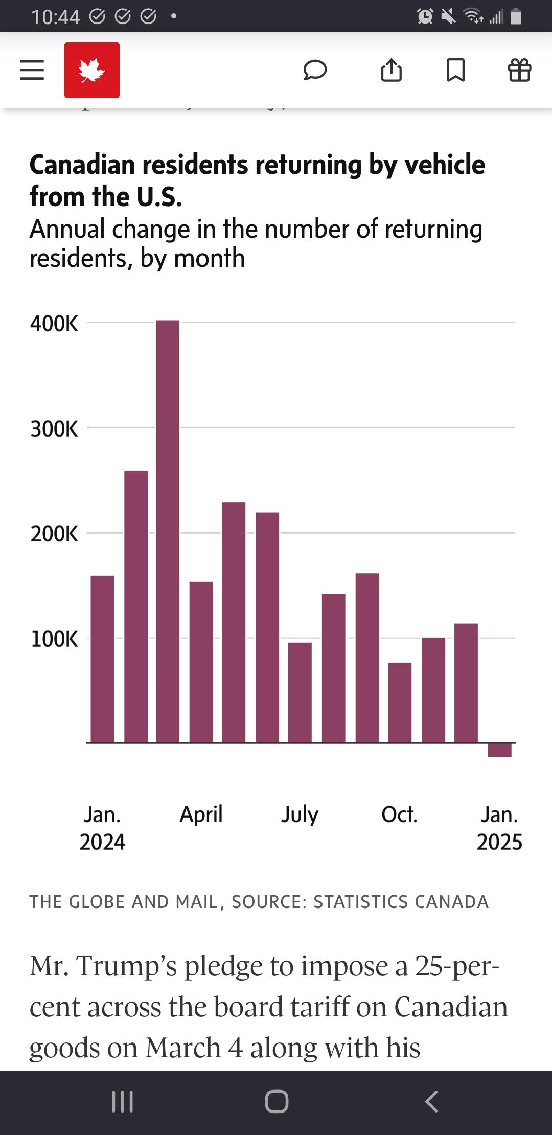
This graph is non-intuative.
So max is 400k returns, so do we assume that this shows 400k out/in trips in Feb 2024?
Jan 2025 shows what? -20k returns, so 20k people leaving Canada and not coming back?
Yeah, this isn’t making much sense. What’s also frustrating is that it’s a screenshot from an article, which presumably could provide context to the chart.
Why isn’t there a link to the original article itself? No source, nothing?