

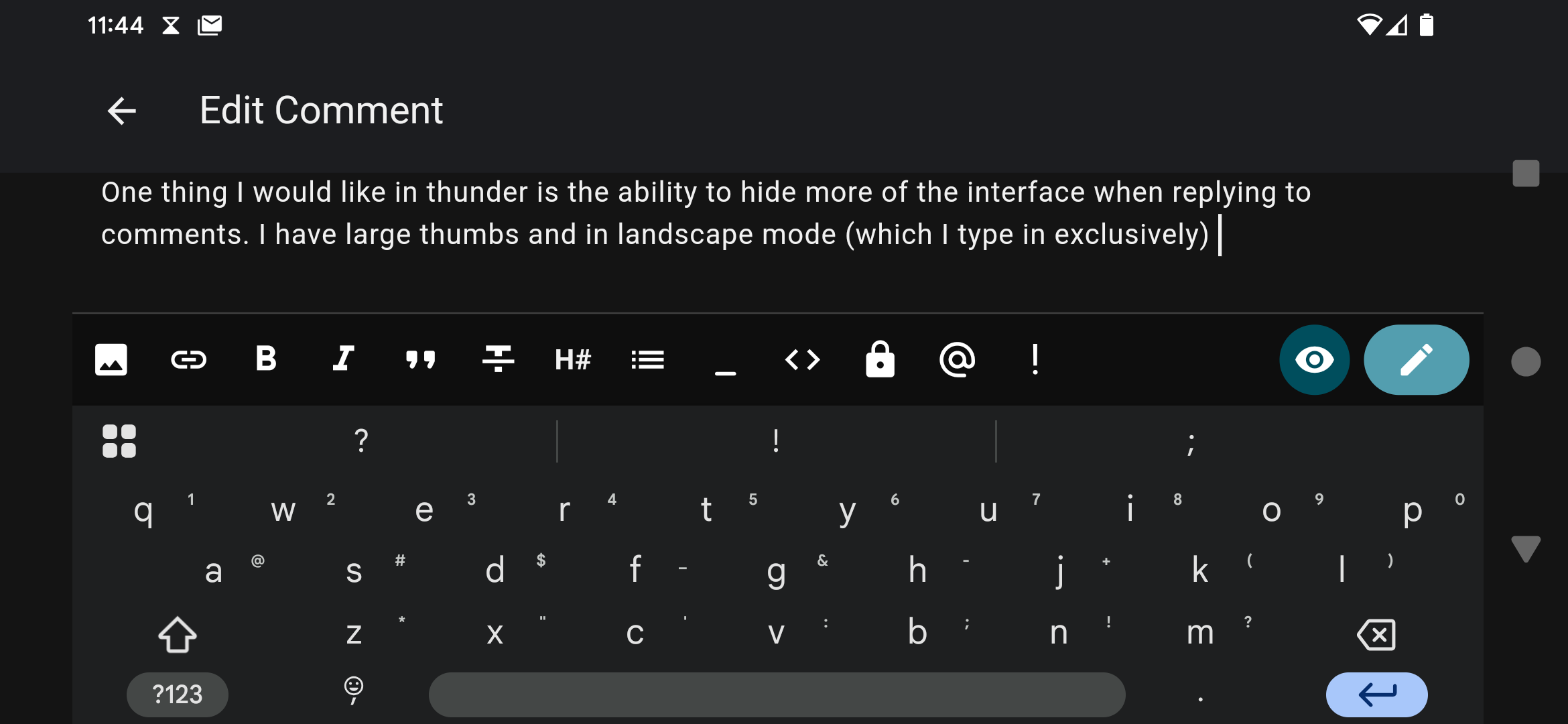
Posting a screenshot of the interface when I’m typing a comment reply as an example. I have large thumbs and I have to scale the keyboard up pretty high to be able to type. Thunder has what I would call a lot of wasted space in comment reply mode. The button bar could be hidden (it’s not something I really use) and either the header text could be shrunk or omitted entirely. Just making the header scroll rather than being fixed could work as well. This would probably be a good use case for floating action buttons. There’s basically only two things I care about when typing a comment reply: seeing the text I’m typing, and referencing the text I’m replying to. Would love some options that allow me to maximize the space used.
Seems like Thunder might not be optimized for use in landscape mode.
Mine’s even worse! I see literally none of the text I type. (I don’t actually use landscape mode to type. I just think it’s funny.)

Thanks for the feedback!
I do agree that it feels like there’s wasted space when in landscape mode. It would be helpful if you could also create a GitHub issue on this so that we can better track the issue!