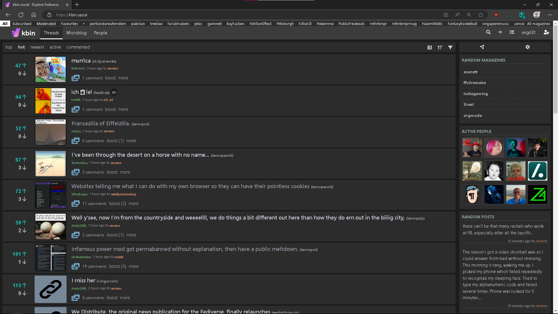
Hi all!
As many of you, I fallen in love with the UI customizations @the8thbit gifted us with its slim userstyle here. I simply love you, man.
Inspired by its design I customized it enough to make my transition from reddit as easy and familiar as possible, so the my updated UserStyle has:
-
moved the article preview image to the left
-
to keep the same formatting, added a placeholder image for article without one
-
full page width usage
-
colors vote buttons, magazine & user links
-
increased the size/color of “preview-image” icon
Hope someone will enjoy this experience like me :)
Here the link:
https://userstyles.world/style/10543/kbin-social-compact-and-reddit-like


I like the compact list, but I don’t like article pages with full-width paragraphs. That makes it far less readable. There should be a max paragraph width to make it more readable.