- cross-posted to:
- [email protected]
- cross-posted to:
- [email protected]
You must log in or register to comment.
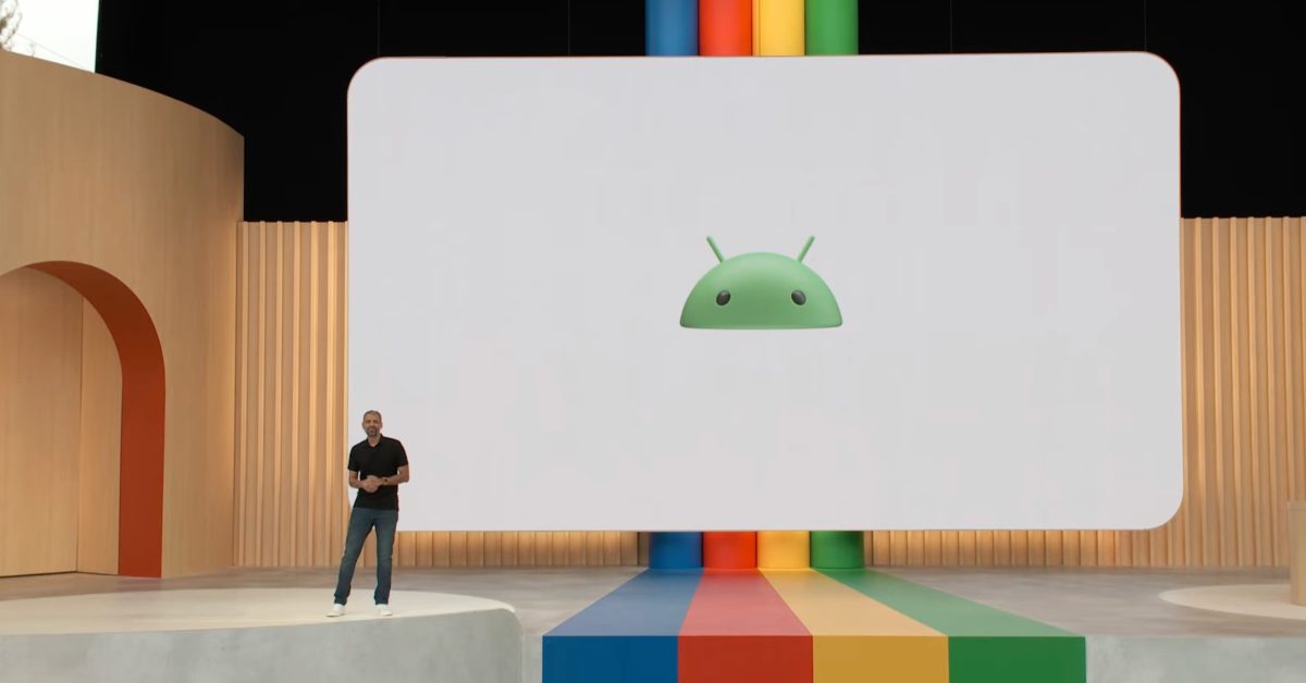
i like it. i’m glad to see a bit of depth and personality coming back into the design à la mode
Yeah, hopefully the flat design trend starts to go away, at least to some extent
I really, really don’t like it.
It feels like Windows Vista to me. I hate it.
I am fine with the capitalized logotype, but I think the that the icon shading hurts its legibility at smaller sizes.
A redesign I don’t immediately hate? I really hope this is a return to more 3D logos and UI elements, not a fan of how flat everything is nowadays.
deleted by creator
It reminds me of an old tablet that had a similar bootanimation logo, i like it.
this little guy? i loved him


