
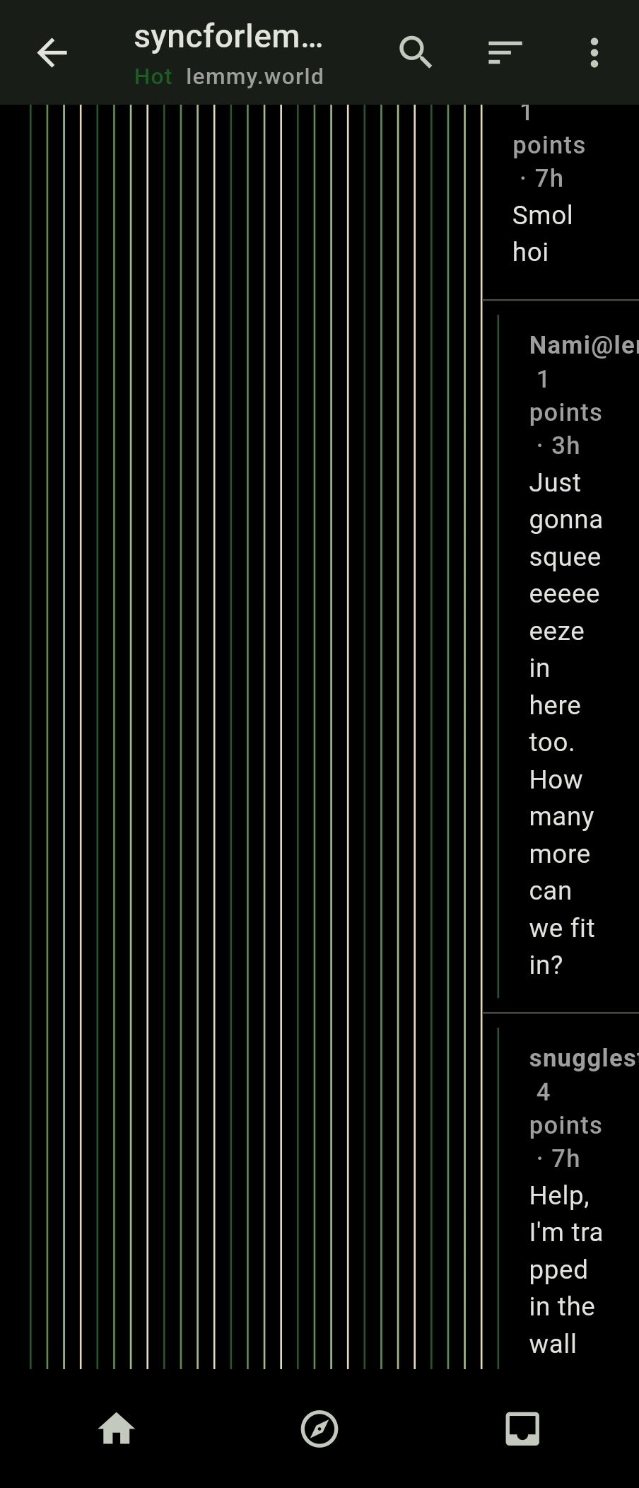
I was looking at the thread for Sync because I was wondering how the same issue might be handled in Connect. Seems like it has the same issue. RIF handled this by having a view more button that displayed child comments in a separate view once the nested levels hit a certain threshold so they weren’t smushed against the edge of the screen.
Can confirm. I’d prefer if the colored bars were slightly wider, and the black space was eliminated, or reduced to a single pixel wide. The nesting markers don’t need to take up nearly that much space. The “continue this thread” links are still needed, but making better use of the space fixes most of the problem.
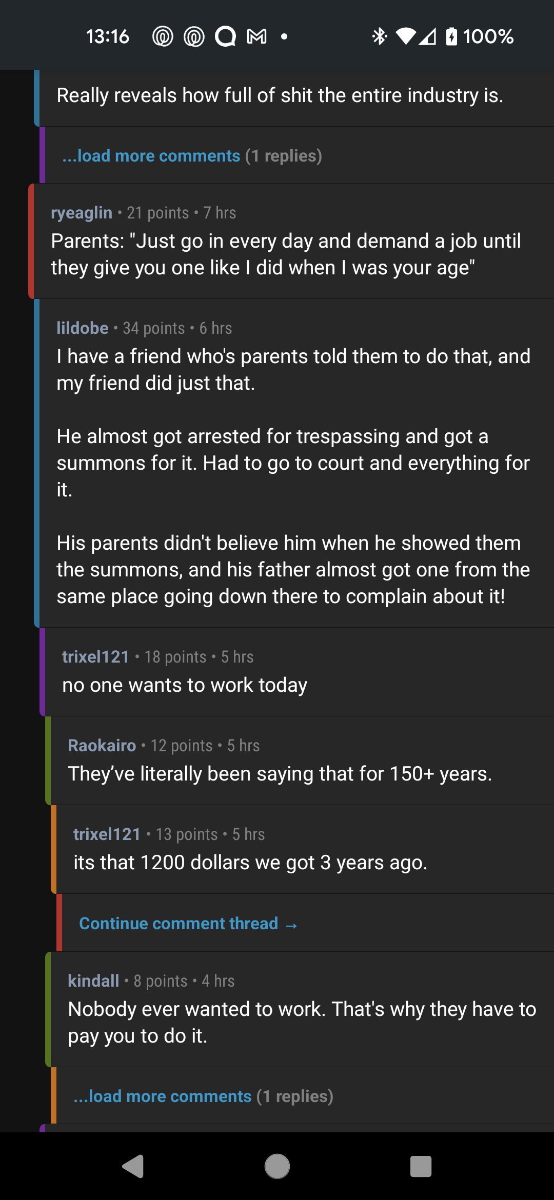
I really like how Relay for Reddit does it.
I’d prefer if the colored bars were slightly wider, and the black space was eliminated, or reduced to a single pixel wide. The nesting markers don’t need to take up nearly that much space.
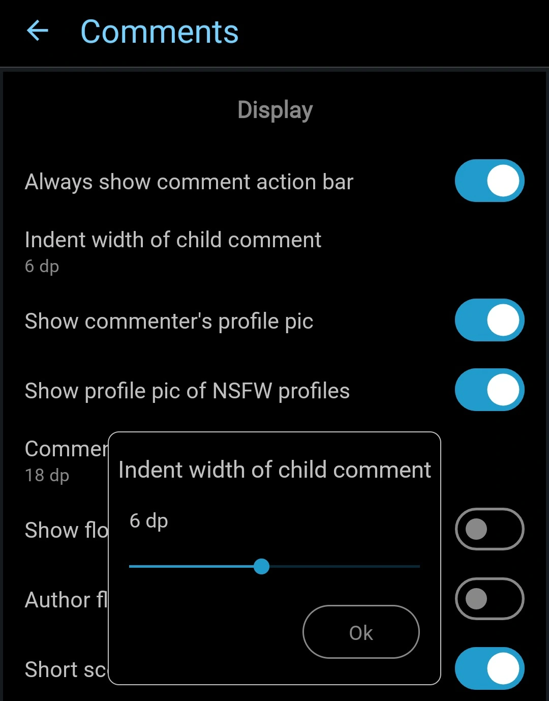
I always like more options. Joey for Reddit had “indent width of child comment” as an adjustable setting:
You got a link to this post? Wondering how it will look in summit 😄
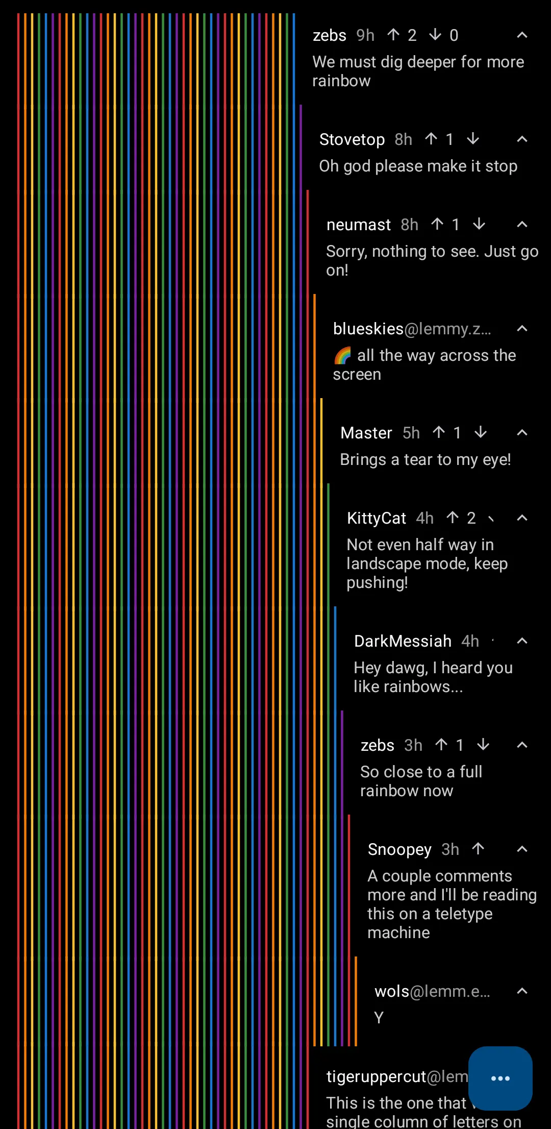
Wow, so much colors 😄
deleted by creator