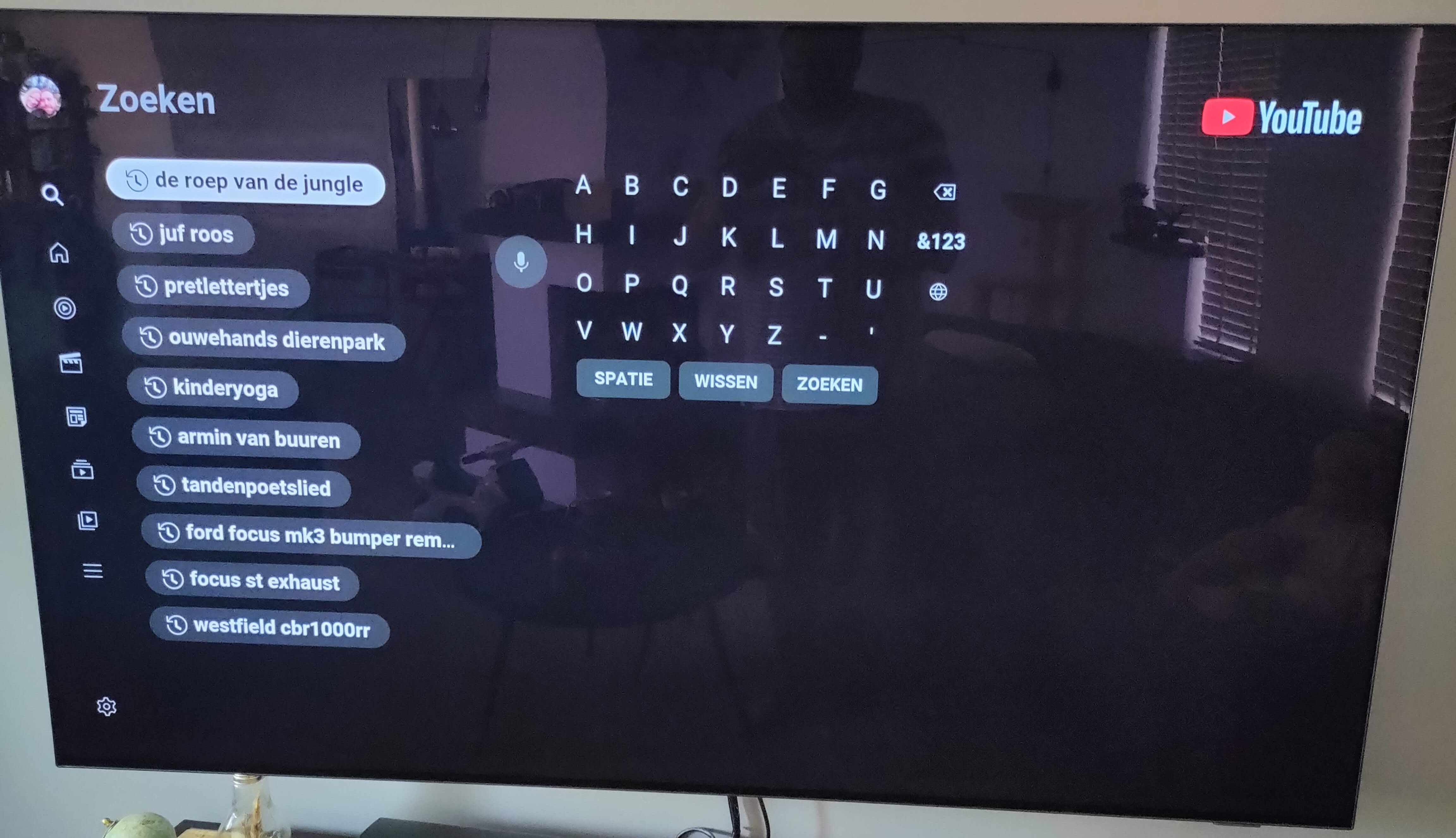
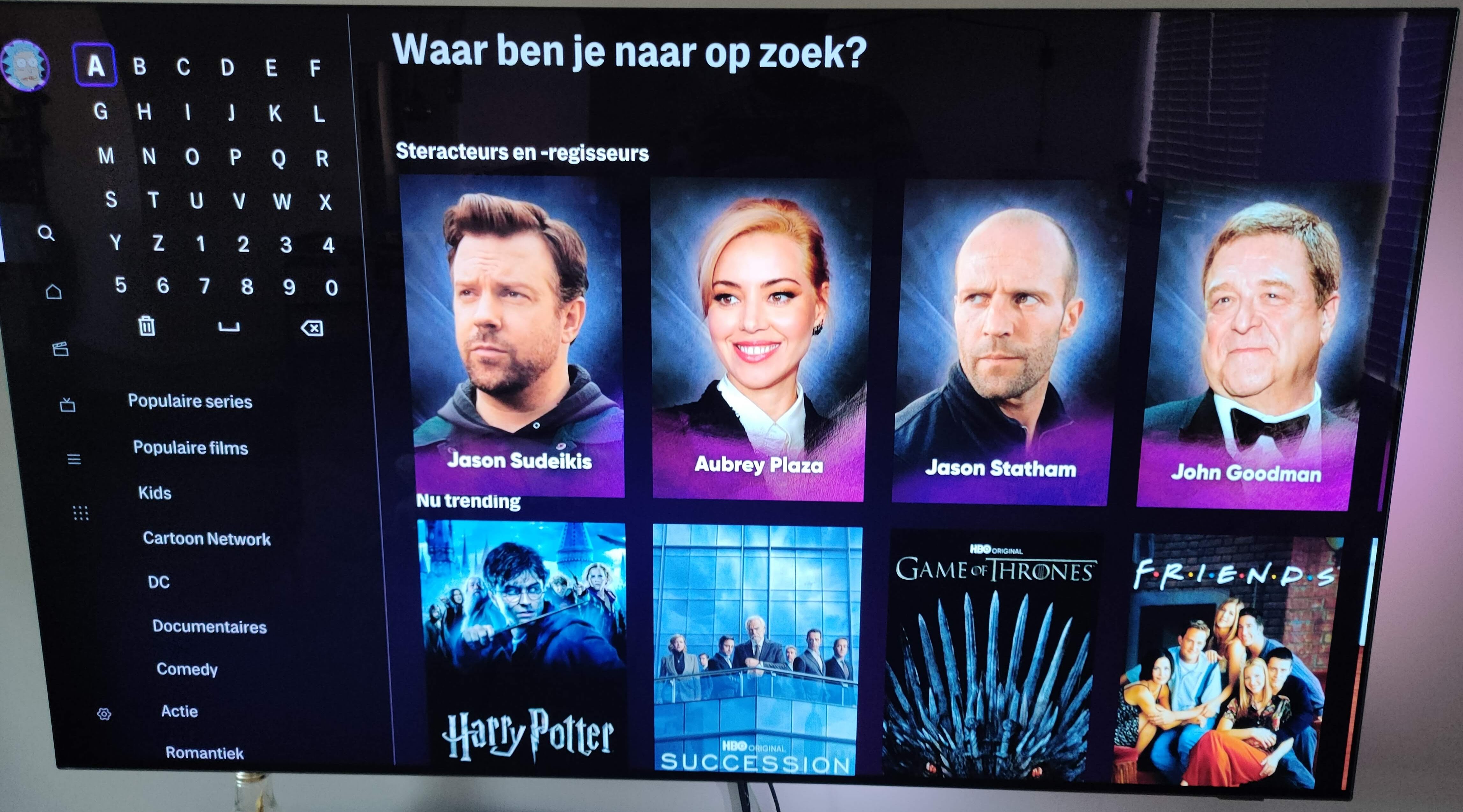
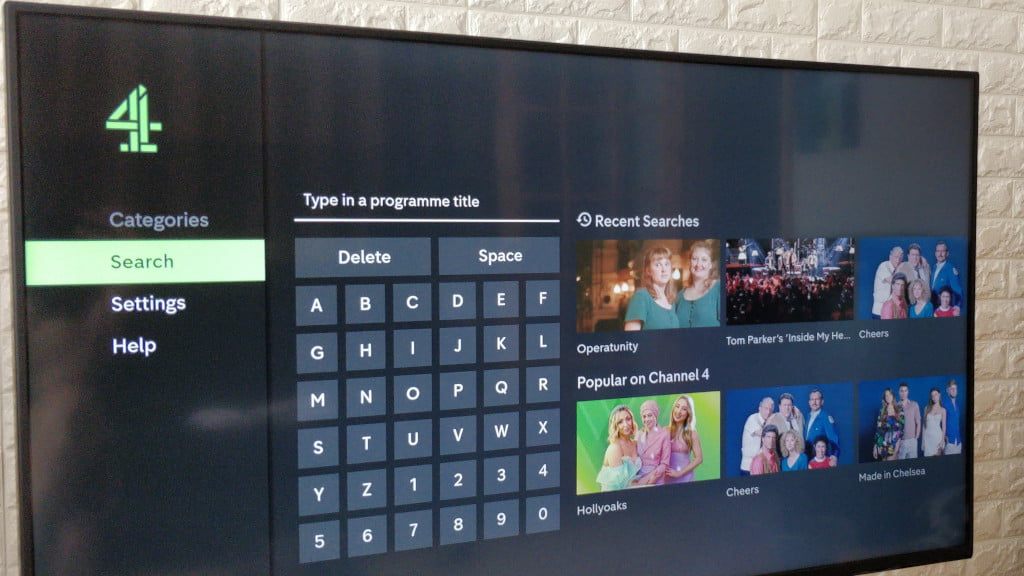
I’ve written a blog post about the most important technological issue of our time - why every streaming service has its own weird keyboard.
I don’t really mind the alphabetical order. As others have already mentioned not everyone knows QWERTY, but most people know the alphabet.
The worst layout I’ve seen is where all the letters are in a single row. I think AppleTV is like this and I feel like I’ve seen it with at least one or two other services. But at least with AppleTV I can usually use my phone as a keyboard if I’m typing more than a couple characters.
It would be nice if there was a consistent layout that all the apps would use.
I would go as far to say don’t use on screen keyboards at all. Use an app. I know they have to have something for those who don’t have smart phones but Chromecast is a breeze to use compared to every other smart TV I’ve had to deal with.
I’m surprised I never really noticed this, but it explains why my brain freezes up for a moment every time I go to search for something in a streaming service, haha. Very odd, very unintuitive!
As much as I agree with the argument for QWERTY agaist Dvorak or Colemark as a default, alphabetical ordering seems more generally standard than even QWERTY. And in any case, when typing something on the TV the remote seems to be the real bottleneck.
This has never bothered me before but it has now, thanks
Interesting blog post. Yea, those a-z layouts are really weird. They remind me of the text input the old Pokémon games had. On Smart TV’s I always try to avoid using the keyboard if it is possible to type the input on my phone.
As a Dvorak user, Dvorak is pretty terrible for single-finger typing since the focus is on hand-alternation. If I had the choice I’d probably choose this.
There have been layouts developed for single or limited-finger use and I think it’s a shame they never caught on.
Have to respectfully disagree on this. For typing purposes, QWERY is indeed better, but if you’re using a remote’s up-down-left-right buttons, I feel a-z feels more familiar.
What about Youtube and HBO Max?


Yeah those keyboard layouts are TERRIBLE! Takes forever to type anything and I usually make mistakes too. Now I use AppleTVs and as soon as I open a search field my iPhone pops up a keyboard to type instead of using the remote, or I can use the Siri Remote to dictate the phrase. Still would prefer a QWERTY layout though.
QWERTY should’ve been retired with the typewriter. It makes zero logical sense to use on touch screen let alone remote. Familiarity isn’t a good enough reason.
As a colemak user, I would prefer abc instead of qwerty
As a full time colemak user, QWERTY really does my head in these days. I regress to a one-finger typist every time!


