


The State Emblem Redesign Commission is set to reconvene next month to choose a new state flag and seal. The panel found six flag and five seal designs Tuesday that will move on.
It’s gotta be this one if they’ve got any sense.
Imo, F1953 is also pretty good, though that one’s also nice.
What has me a bit disappointed is that the North Star Flag wasn’t a finalist. I prefer it to all of the 6 here.
I do too, the North Star is my favorite. I like the other one you linked, I guess we have similar flag preferences
Agreed. The other designs resemble corporate medical/biotech/pharma logos, which are big in Minnesota, but don’t belong on the flag.
That’s beautiful.
This is the current state flag for reference. Any they pick is a huge improvement IMO
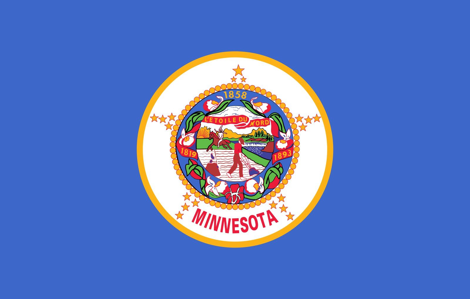
Goodness, that is terrible, I see why they’re looking to replace it.
These two are probably my favourites:


Not to much a fan of swirly designs like this, looks too much like a logo and not so much like a flag:

But mostly, I’m disappointed that my laser loon flag did not qualify as a finalist:

Any explanation as to what these are supposed to symbolize?
I am curious, what is the story behind “L’étoile du nord” ?
It translates as The Star of The North, or The North Star, in reference to the position of Minnesota as the northern-most contiguous US State, because of the small bit that sticks up higher than the 48th Parallel (aka The Northwest Angle).


