- cross-posted to:
- [email protected]
- [email protected]
- cross-posted to:
- [email protected]
- [email protected]
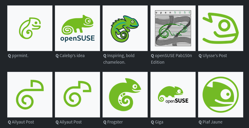
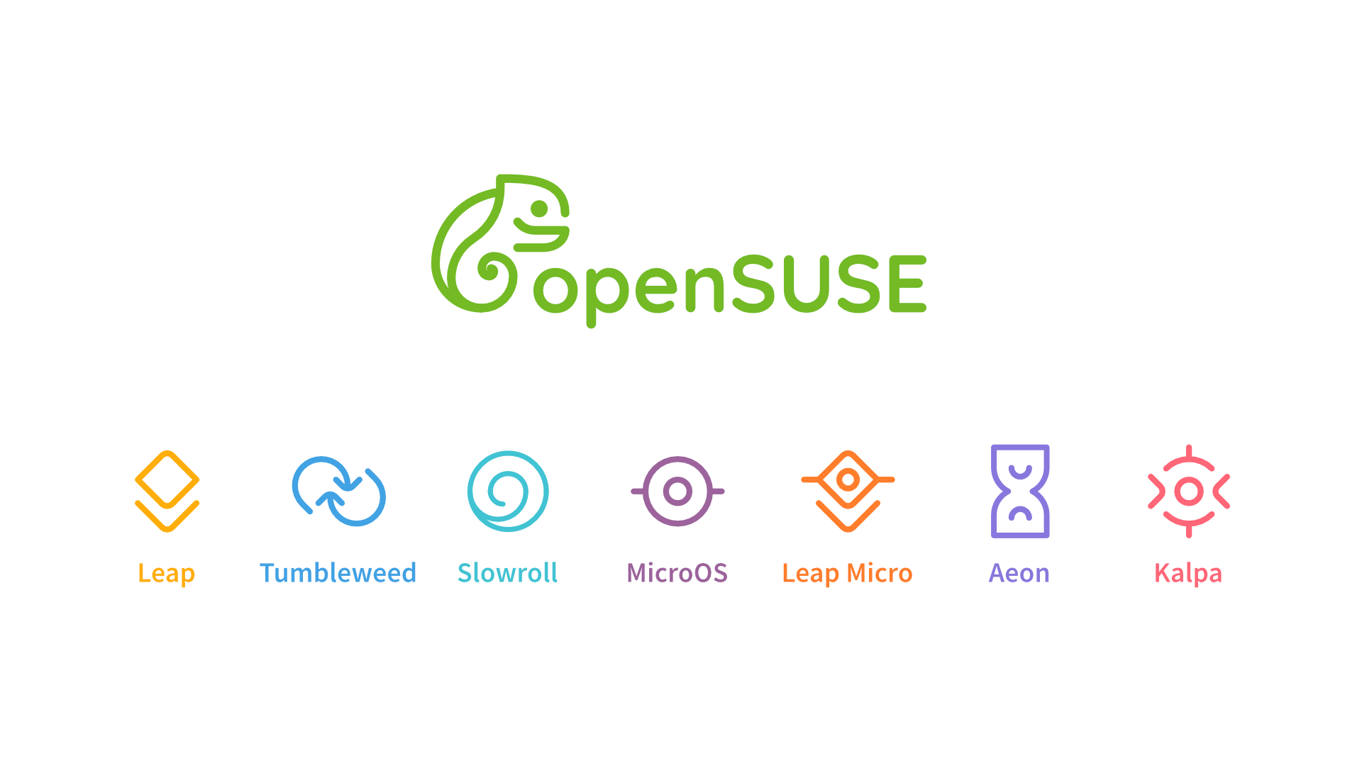
The openSUSE community’s logo contest submission phase is now complete and voting for the logos has begun.
This competition marks a pivotal moment for openSUSE and the voting goes until Dec. 10.
Before making any selections, people are encouraged to visit en.opensuse.org/Logocontest and view the logos before voting.
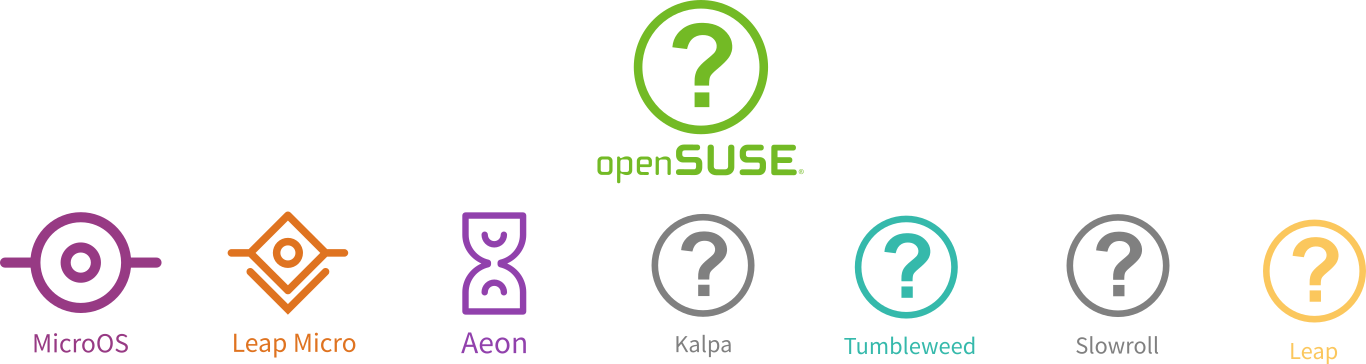
The number of submissions speaks volumes about the community’s enthusiasm and engagement with 18 submissions for Kalpa, 24 submissions for Slowroll, 21 submissions for Leap, 32 submissions for Tumbleweed and an impressive 36 submissions for a potential new openSUSE logo.
You must log in or register to comment.
Bottom row, 2nd from the left. Simple, clean, distinct.
Agreed, it really stands apart from all the rest.
Even from the one right next to it that looks almost identical??
Especially that one.
These are two variations from the same artist.
Aliyaut’s logo? It is clean, but it’s hardly even identifiable as a gecko. It blends in too much with all the modern corporate logos we have today IMHO. It’s not a bad choice if they decide to go with it, but they could do better.
Does the order get shuffled each time?

Ailyaut must be a debian fan :)
No
In the thumbnail?
deleted by creator
Please not another ultra minimal mono color logo
Too bad for you, they already have the logos for some of the variants and that’s exactly what they’re going for.
Agony
Yeah felt very obvious which ones will be chosen regardless of the survey…
I don’t feel like they’re inherently bad, but they’ve become so popular that they all feel like they’re blending together. I think it’s kind of stale at this point.
In my opinion one of the full design themes should be picked because some of those single designs look very nice individually but would clash with others.
My pick would be Emiliano’s theme, it looks the most like an evolution of the opensuse style. Imo the others are either a bit too minimalist or deviate too strongly from the original design.
Nikolayan’s design is also good, but I prefer Emiliano’s because that you can recognise the chameleon better in every logo.
I like this one
It is a friendly recognizable chameleon and they did a good job with integrating the existing abstract logos.
From the Solo designs I loved the ones with the branch with different endings a lot. It had a warm touch to it, but was a little to filigrane for a logo.
Kinda looks like an embryo to me.
I can’t help but see a squirrel!
Well, I love squirrels!
That one is my favourite. Cute chameleon (or was it gecko), but also simple. Looks great
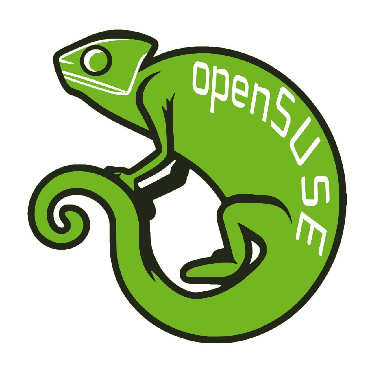
Always has been a chameleon. It was named Geeko, which generated some confusion.
I also liked it, but I had a religious objection to it.
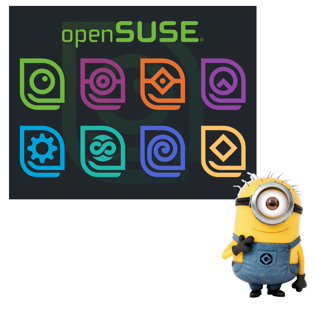
Note that there are way more logos than those you see in the preview.
Bottom row, far right. Simple, minimalist, caffeinated, unhinged.
Also looks like Toothless from How To Train Your Dragon.
This is a very important feature
I don’t hate it. I feel like the goofy smile makes it just distinguishable enough to stick out from all the other minimalist logos.
People would ask what guy is it
The Kalpa goatse logo is interesting

I liked the ones that didn’t stray too much from the original. I always liked the gecko, but found it to be a bit weird looking.
I really like these two :

The first one is definitely a xenomorph
too bad they’re already doing minimal mono color logos. maybe if one of these designs shifted to adding up all of the colors of the remixes it’d work
Can someone explain to me what the fuck are the abominations labeled “Pab150n”?
I am a bit late but this is the description: Represents the redesign of the SUSE logo to combine it with Colombian styles from the 70s and 80s
Thanks, just looking at it made me dizzy lol.
I love all of the minimalist options here, they are so cute!
Removed by mod
Giga, but tuck openSUSE closer to the mascot. Use the negative space between the feet and above the open in a clever way.
I just hope they don’t ruin the logo with too much minimalism. There are good submission in all of that
The survey is crap on Mobile! Literally not useable
pprmint designs are by far superior imo
Most of them are pretty good IMO