Software developer, Miniature enthusiast
- 13 Posts
- 34 Comments

 2·3 months ago
Those are excellent!

 4·3 months ago
Those are really cool!
That is wicked cool!
Those look great! I have trouble painting at that scale. seeing all the details on the windows and like. You have my respect sir.
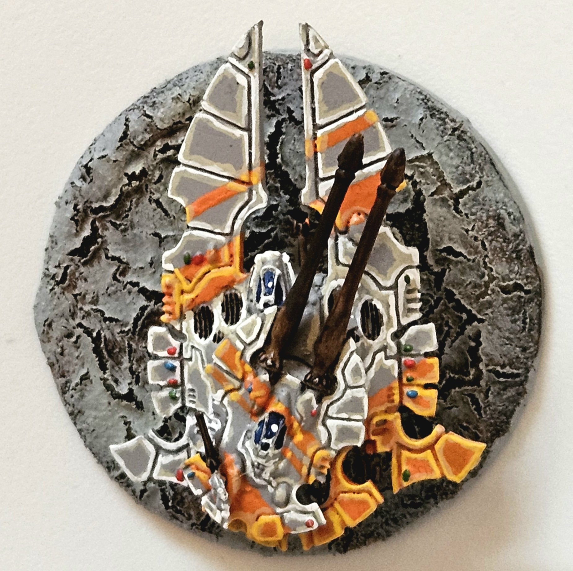
That’s looks really cool! dig the sponsons and overall paint scheme.
Colors and shading are good! I like the objective marker as well.
It’s been a learning exercise
Thank you!

 2·2 years ago
Thank you!
I designed and printed the base. The Mini’s are from the Warhammer Underworlds season 2 starter box. Thorns of the Briar Queen.
Here is a link for some more generalized miniature display trays that I’ve made. https://miniforall.com/minidisplaytray
In this case it’s printed. To be fair I’ve been staring at the code for a good month or so. I wrote it using cadquery.

 1·2 years ago
Replied to the wrong comment, I’m equally surprised to see comments on this thread I assumed it was a dead post. Anyways I didn’t think it would get a enough traction to pull up on c/all
There’s a ton of good stuff in there, and it’s all over the place. Each issue pretty much stands on it’s own.
Games Workshop - Warhammer Underworlds season 1, Spiteclaw’s Swarm
Diorama Miniature Display Trays I’ve been working on an Escher gang that I’m going to have my wife paint. Part of the gang is I modeled and printed a display tray.


The stl’s and source code are available for free: https://miniforall.com/minidisplaytray.html
If this kind of content is unwanted I’ll remove it.

 2·2 years ago
those look great!


Thank you! Yeah I’m pretty happy with how the came out. I was worried that the “race car” orange and red one was too busy but when put next to the plainer ones it balances out pretty well.